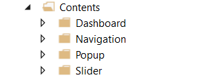
Contents
The folder Contents contains in further subfolders all existing pages or .content files of the project. The contents are built according to certain structures. These are only recommendations.
As desired, additional files of the type .content can be created or the existing contents can be deleted or edited.
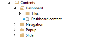
Dashboard
The Contents/Dashboard folder contains all the contents required for the dynamic dashboard in the Plastic Application HMI project.
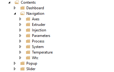
Navigation
The folder Contents/Navigation contains all contents categorized in folders that can be found in the navigation of the Plastic Application HMI project (axes, extruder, injection, parameter, process, system, temperature and WTC). This corresponds to the structure of the Contents/Slider folder in order to make it easier to assign the contents it contains.
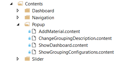
Popup
The Contents/Popup folder contains all contents that appear as pop-up windows in the Plastic Application HMI project(materials, grouping of temperature channels and dashboard configuration).
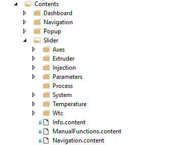
Slider
The Contents/Slider folder contains all contents categorized in folders that are used in the slider area of the Plastic Application HMI project (axes, extruder, injection, parameters, process, system, temperature, WTC, info, manual functions and navigation). This corresponds to the structure of the Contents/ Navigation folder in order to make it easier to identify the contents it contains.
 | Update capability of the Plastic Application HMI Editing the Plastic Application HMI can lead to an impairment of the update capability. This may affect the support provided by Beckhoff Automation. |
Naming controls
The naming (Identifier) of the controls within a content is done according to a special scheme to avoid duplicate naming, as this leads to errors.
The naming in the Plastic Application HMI project follows the following scheme: ContentName_XYZ_ControlType
- ContenName
- The name, i.e. the ID of the content (the identifier of the control of type
TcHmi.Controls.System.TcHmiContent). - Example: Temperature_Parameter_Settings
- XYZ
- Any description of the control is possible. The hierarchical arrangement within the content can be observed.
- Example: Group1_Active_On
- ControlType
- Type of the control. An abbreviation is used.
- Example: For the control of type
TcHmi.Controls.Beckhoff.TcHmiButtonthe abbreviation Button would be used.
Result: "Temperature_Parameters_Settings_Group1_Active_On_Button" is the ID of the described button on the content Temperature_Parameter_Settings.content with the previously described scheme.
Overview of controls with possible abbreviations
Control type | Abbreviation |
|---|---|
TcHmi.Controls.Beckhoff.TcHmiButton | Button |
TcHmi.Controls.Beckhoff.TcHmiCheckbox | Checkbox |
TcHmi.Controls.Beckhoff.TcHmiCombobox | Combobox |
TcHmi.Controls.Beckhoff.TcHmiDatagrid | Datagrid |
TcHmi.Controls.Beckhoff.TcHmiEllipse | Ellipse |
TcHmi.Controls.Beckhoff.TcHmiEventGrid | EventGrid |
TcHmi.Controls.Beckhoff.TcHmiEventLine | EventLine |
TcHmi.Controls.Beckhoff.TcHmiFileExplorer | FileExplorer |
TcHmi.Controls.Beckhoff.TcHmiLine | Line |
TcHmi.Controls.Beckhoff.TcHmiLinearGauge | LinearGauge |
TcHmi.Controls.Beckhoff.TcHmiLocalizationSelect | LocalizationSelect |
TcHmi.Controls.Beckhoff.TcHmiRadialGauge | RadialGauge |
TcHmi.Controls.Beckhoff.TcHmiRadioButton | RadioButton |
TcHmi.Controls.Beckhoff.TcHmiRectangle | Rectangle |
TcHmi.Controls.Beckhoff.TcHmiObjectBrowser | ObjectBrowser |
TcHmi.Controls.Beckhoff.TcHmiStateImage | StateImage |
TcHmi.Controls.Beckhoff.TcHmiTextblock | Text block |
TcHmi.Controls.Beckhoff.TcHmiTextbox | Text box |
TcHmi.Controls.Beckhoff.TcHmiToggleButton | ToggleButton |
TcHmi.Controls.Beckhoff.TcHmiToggleSwitch | ToggleSwitch |
TcHmi.Controls.Beckhoff.TcHmiTrendLineChart | TrendLineChart |
TcHmi.Controls.Beckhoff.TcHmiUserManagement | UserManagement |
TcHmi.Controls.FavoriteBarControl.FavoriteBarControl | FavoriteBar / FavoriteBarControl |
TcHmi.Controls.Plastic.ArrowMotionGraphControl | ArrowMotionGraph / ArrowMotionGraphControl |
TcHmi.Controls.Plastic.BlowPressureChart | BlowPressureChart |
TcHmi.Controls.Plastic.CamControl | Cam / CamControl |
TcHmi.Controls.Plastic.Configurator | Configurator |
TcHmi.Controls.Plastic.CurveEditorControl | CurveEditor / CurveEditorControl |
TcHmi.Controls.Plastic.InputBox | InputBox |
TcHmi.Controls.Plastic.ManualOperation | ManualOperation |
TcHmi.Controls.Plastic.MeasurementUnitSelector | MeasurementUnitSelector |
TcHmi.Controls.Plastic.MonitoringControl | Monitoring / MonitoringControl |
TcHmi.Controls.Plastic.PfwSingleTempControl | PfwSingleTempControl |
TcHmi.Controls.Plastic.PfwTempParameters | PfwTempParameters |
TcHmi.Controls.Plastic.ProcessScheduler | ProcessScheduler |
TcHmi.Controls.Plastic.StateIndicator | StateIndicator |
TcHmi.Controls.Plastic.Table | Table |
TcHmi.Controls.Plastic.TemperatureScheduler | TemperatureScheduler |
TcHmi.Controls.Plastic.TimerControl | Timer / TimerControl |
TcHmi.Controls.Plastic.UserLoggingViewer | UserLoggingViewer |
TcHmi.Controls.Plastic.ZoneConfiguration | ZoneConfiguration |
TcHmi.Controls.Plastic.ZoneGrouping | ZoneGrouping |
TcHmi.Controls.Plastic.ZoneImageLayout | ZoneImageLayout |
TcHmi.Controls.ResponsiveNavigation.TcHmiBreadcrumb | Breadcrumb |
TcHmi.Controls.ResponsiveNavigation.TcHmiNavigationBar | NavigationBar |
TcHmi.Controls.ResponsiveNavigation.TcHmiNavigationContent | NavigationContent |
TcHmi.Controls.System.TcHmiContainer | Container |
TcHmi.Controls.System.TcHmiContent | Content |
TcHmi.Controls.System.TcHmiGrid | Grid |
TcHmi.Controls.System.TcHmiPopup | Popup |
TcHmi.Controls.System.TcHmiRegion | Region |
TcHmi.Controls.System.TcHmiView | View |
Standard Content structure
Most contents are built using grids. The grids make it easier to align the other controls that are in that grid to allow for the tile design that is consistent throughout the project. The contents or controls added to the grid are also arranged in smaller grids to make it easier to align the controls contained within a tile. The grid, which is to represent a tile, can be assigned the CSS class from the Beckhoff.TwinCAT.HMI.Plastic.Themes NuGet package with the name Tiles via the ClassNames property of the Common category to color the background color white, round the corners and add a slight shadow. Using the CSS class TilesHeadline from the same NuGet package, you can quickly customize the appearance of the text block for the tile heading. The class colors the background of the text block in an appropriate shade of gray, the text color becomes white and the corners are adjusted according to the tile. A height of 45 px is usually used for the heading text block.
Use of grids
When using grids in grids, pay attention to the Z-index of the controls. If a control (e.g. a TcHmiGrid) is located within a TcHmiGrid control and its size exceeds the specified range of the corresponding location in the grid, this may mean that some contained controls (such as TcHmiButton controls) can no longer be operated. Thus, the Zindex property of the Layout category of the control that is inside a grid should be given a higher value. For the outer grid, for example, the Zindex property can be set to 0.
Special case: Creation of multiple pages in one content
The content intended for the slider area can be larger than the actual available space. Thus, for example, the width of the content can be twice as wide as the actual available space of the TcHmiRegion control if a second page is to be created. By changing the Left properties from the Layout category, the included grid that fills the entire content will be shifted accordingly to display the specific content that is desired. This can be done, as in the Plastic Application HMI project, using controls of type TcHmiRadioButton.
Example: Manual functions
| Available from version 12.6.0 |
| Available in the variants (link):
|


