Histogram
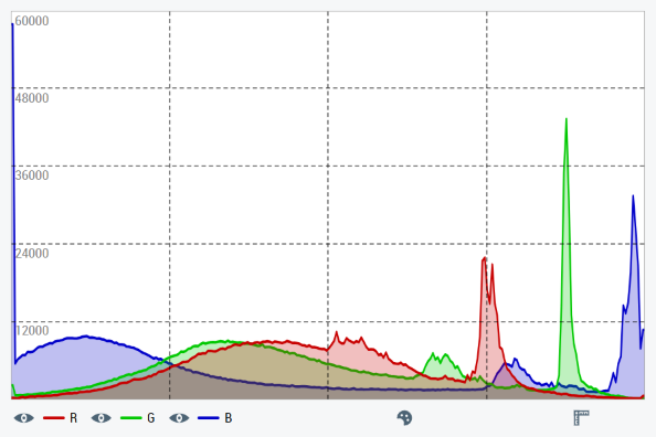
The histogram control TcHmiVnHistogram generates a histogram from an image and displays it. It also offers the option of converting the image from the color format RGB to another before generating the histogram. The histogram can be displayed as a line or bar chart. The description of each configuration option can be found under the following categories on this page. For each category there are sub-chapters with further information, details and application examples. In order to directly process TwinCAT Vision images from the PLC, the Vision extension for the HMI server is also required.
 | For all the following attributes, the control has a getter and a setter method. For example, for the attribute All further attributes, events and permissions provided by the Controls base class can be found in the TwinCAT HMI documentation. |
Category: Colors
Attribute | Type | Description |
|---|---|---|
|
| Background color of the histogram. |
|
| Color of the selection marker on the histogram. |
|
| Color of the grid lines on the histogram. |
|
| Color of the labels that label the grid lines with frequency values. |
|
| Foreground color of the Infobar. |
Category: Common
The following attributes fix the Resource and the View of the histogram.
Attribute | Type | Description |
|---|---|---|
|
| Resource for the image to be displayed. Can be either a path to an image file or a data URI. |
|
| Image format into which the image is converted before the histogram is calculated. The input image is always interpreted as RGB. |
|
| Defines the display of the color channels. This includes:
|
|
| Histogram type. Possible are:
|
|
| The calculated histogram data of the current image as a two-dimensional, numerical array. The array contains the frequency values per color channel and color value. The first dimension of the array corresponds to the color channels and the second dimension corresponds to the color values. |
Category: Selection
The following attributes and functions relate to the Selection of color values.
Attribute | Type | Description |
|---|---|---|
|
| Determines whether several consecutive color values ( |
|
| Lowest color value of the current choice. For single selection, this is the selected color value. |
|
| Highest color value of the current choice. For single selection, this is the selected color value. |
|
| Frequency values of the individual image channels from the current choice for single selection, average values for range selection. |
Function | Description |
|---|---|
| Cancels the current color value choice. |
Category: Infobar
The following attributes can be used to customize the Infobar of the control.
Attribute | Type | Description |
|---|---|---|
|
| Determines whether the infobar is displayed. |
|
| Fixes whether the legend is displayed in the infobar. |
|
| Determines whether the frequency values of the current selection are displayed in the infobar. |
|
| Determines whether the brightness range (bin) associated with the current selection is displayed in the infobar. |
|
| Font of the Infobar. |
|
| Font size of the info bar. |
|
| Font style of the Infobar. |
|
| Font weight of the Infobar. |
Category: Grid
The following properties can be used to customize the control's Grid lines.
Attribute | Type | Description |
|---|---|---|
|
| Fixes whether grid lines are displayed on the histogram. |
|
| Fixes whether horizontal grid lines are displayed on the histogram. |
|
| Number of horizontal grid lines. |
|
| Fixes whether vertical grid lines are displayed on the histogram. |
|
| Number of vertical grid lines. |
|
| Thickness of the grid lines. |
|
| Style of the grid lines. Possible are:
|
Category: Subgrid
The following attributes can be used to adjust the Sub-gridlines of the control.
Attribute | Type | Description |
|---|---|---|
|
| Fixes whether vertical sub-grid lines are displayed on the histogram. |
|
| Number of horizontal sub-grid lines between two horizontal grid lines. |
|
| Thickness of the sub-grid lines. |
|
| Style of the sub-grid lines. Possible are:
|
Category: Labels
The Labels, which label the grid lines with frequency values, can be customized with the following attributes.
Attribute | Type | Description |
|---|---|---|
|
| Fixes whether a label with the corresponding frequency value is displayed per horizontal grid line. |
|
| Display position of the labels. At |
|
| Font of the labels. |
|
| Font size of the labels. |
|
| Font style of the labels. |
|
| Font weight of the labels. |
Events
All events are listed in the Vision category.
Event | Description |
|---|---|
| This event is triggered when the control receives an image. |