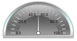
Pointer instrument 180°
The pointer instrument can be used to add a revolution counter to the visualization, for example. The arrow positions itself based on the value of the assigned variables. The element has a preconfigured design, for which a background color can be set. Optional, this design can be replaced by a user-specified background image. The scale can be subdivided into color areas. An example of the configuration can be found in the section "Configuration of a pointer instrument".
Properties editor
The properties of a visualization element - except alignment and order - can all be configured in the properties editor. By default, this editor opens next to the visualization editor, or it can be opened explicitly via the "Properties" command (which can be found in the View menu as standard).
A property can be modified by editing the field "Value". To this end, an input field, a selection list, a dialog or checkbox that can be activated is provided in this field, depending on the element type. The value field opens
- after a double-click,
- after a single click in a selected field,
- via the space bar, if the field was already selected.
If a variable is assigned,
- simply enter its name.
- Use the
 button to open the input assistant for selecting a variable. The Variables category lists all variables that have already been defined in the project.
Working in the list of properties can be made easier with the aid of default, sorting and filter functions.
Element properties
All element properties and their descriptions are listed below.
Element name | The element name can be changed. Standard name is "GenElemInst_x". "x" stands for a sequential number. |
Element type | The element type is entered here. For three element groups it is possible to switch between the corresponding elements by changing the element type: |
Auxiliary setting
Value | Numeric variable, whose value is displayed as the deflection of the arrow. |
Position
Here you can define the position (X/Y coordinates) and size (width and height) of the element in pixels. The origin is in the top left corner of the window. The positive x-axis is on the right, the positive y-axis runs downwards. If the values edited, the displayed element is simultaneously modified in the visualization editor.
X | Horizontal position in pixels – X=0 is the left edge of the window. |
Y | Vertical position in pixels – Y=0 is the upper edge of the window. |
Width | Width of the element in pixels |
Height | Height of the element in pixels |
Background
If no user-specified background image is used, the following properties are available:
|
Background color |
Select a color for the bar:
|
If a user-specified background image is used, the following properties are available:
|
Image |
Here you can assign an image from an image pool by specifying the name of the image file or its ID. |
|
Transparency color |
For images with transparent background a color can be selected that is to be shown transparent. The |
Arrow
|
Arrow type |
A number of different arrow types are available for selection:
|
|
Color |
Color, with which the arrow is displayed |
|
Angle range |
Here you can select a 180° section:
|
|
Additional arrow |
If this option is enabled, an additional arrow is shown on the scale opposite the needle. |
Scale
|
Sub scale position |
The sub scale can be shown at the outer or inner radius of the scale ring:
|
|
Scale type |
The scale can be shown as:
|
|
Scale start |
Lower scale limit value |
|
Scale end |
Upper scale limit value |
|
Main scale |
Distance between two lines of the coarse scale |
|
Sub scale |
Distance between two lines of the fine scale. The value can be set to 0, if further subdivision of the coarse scale is not required. |
|
Scale line width |
Width of the scale line in pixels |
|
Scale color |
The color can be set via the selection list or via the |
|
Scale in 3D |
If this option is enabled, the scale is shown three-dimensionally. |
|
Show scale |
The scale is shown if this option is enabled. |
|
Frame inside |
If this option is enabled, the scale ring is drawn with an internal frame. This option is disabled by default. |
|
Frame outside |
If this option is enabled, the scale ring is drawn with an external frame. This option is disabled by default. |
Labelling
|
Labelling |
Here you can specify whether the scale values are positioned on the outside or the inside of the scale. |
|
Unit |
The entered text is used as element label. It is shown below the center of the scale and can be used to specify the unit of the scale, for example. |
|
Font |
Here you can set the font for the unit and the scale:
Click the |
|
Scale format (C-Syntax) |
Use the C syntax to specify the formatting of the scale label. For example, entering the string "%3.2f s" in this field results in scale labels with 3 digits, 2 of which are decimal places, followed by the letter "s". |
|
Max. text width of labels |
Value specifying the maximum width of the scale label. This value is generally set correctly automatically. Only use this setting option if the automatic adjustment does not lead to the required result. |
|
Text height of labels |
Value specifying the height of the scale label. This value is generally set correctly automatically. Only use this setting option if the automatic adjustment does not lead to the required result. |
|
Font color |
The color for the label can be set via the selection list or via the |
 button from the standard color selection dialog.
Positioning
|
Arrow distance |
Arrow length in pixels |
|
Label offset |
Distance in pixels for positioning the label |
|
Unit offset |
Vertical distance in pixels for positioning the text (entered under Label → Unit) |
Colors
A color is defined based on a hexadecimal number consisting of red / green / blue (RGB) components. For each of these three colors, 256 (0-255) values are available, which can be entered here statically. The color can be selected from a selection list or via the color selection dialog, which can be opened via the button . In addition, the level of transparency can be set for each color (0: fully transparent, 255: fully opaque).
Color areas
|
Durable color areas |
If this option is enabled, the color areas are permanently visible. The effects of this option are visible only in online mode. |
|
[<n>] |
Click on the [<n>]: The number indexes the area. Clicking ‘Delete’ deletes the corresponding color area and its settings. |
 button to generate a new color area. For each color area an area is created that covers the corresponding settings.
Area [<n>]
|
Begin of area |
Start of the color range. It must lie within the defined scale. |
|
End of area |
End of the color range. It must lie within the defined scale. |
|
Color |
Color of the bar area |
 | Transparency is not supported under Windows CE. |
Access rights
This setting relates to the access rights for the individual element. Click to open the Access rights dialog. The setting is only available if a user management was added to the PLC project. The following status messages are available:
Not set. All rights. | The default message is set, if the element is shown as available for all groups. |
Rights are issued: Limited rights. | The message is set, if the element is shown with limited behavior for at least one group. |