UiIcon
The UiIcon control can be used to display events and values. It looks like a normal button and can be filled with different icons.
Use
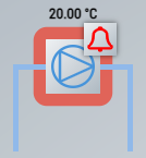
Suitable for creating P&I diagrams to represent various plant components (e.g. pump). The attribute Connections can be used to create suitable connections to connect the UiIcon with a main line, for example.
Features
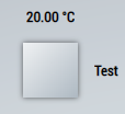
Value displays
Various displays can be added to the UiIcon via the attribute DisplaysData.
Event displays
The attribute EventsData can be used to display various events around the UiIcon.

If the generic approach of TcHmiBa is used and a BaObject / BaView is linked to the control, active events are displayed automatically. When the UiIcon is actuated, the project navigation of the linked object opens and, in the case of an event, the parameter window with the event view opens accordingly.
Attributes
The control inherits from the button and thus has the same attributes. In addition, there are the following attributes.
BA
BaObject
tchmi:framework#/definitions/SymbolSymbol for BaObject for using the generic functionalities of TcHmiBa. Links a single object or a complete view (including children) to the control.
 | The attribute is not applicable to all controls. |
ShowTag
Specifies where the tag of the bound BaObject can be seen. If zero, the tag is not displayed.
Common
DisplaysData
TcHmi.BuildingAutomation.Controls.UiIcon.DisplaysDataThe attribute makes it possible to create different displays via an editor.
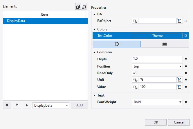
The following properties can be set for each display:
Name | Description |
|---|---|
TextColor | Font color of the display. |
Value | Display value in the display. If a binding exists and ReadOnly is disabled, the value is written to this binding when the user ends the input. |
Position | Position of the display. Several displays created at the same position are arranged on top of each other. |
ReadOnly | Determines whether the display is editable or read-only. |
Unit | Unit to be appended to the value (if it is a number). |
Digits | Number of decimal places. |
FontWeight | Font weight of the text. |
DisplayedDigits
tchmi:general#/definitions/BooleanThe number of decimal places when a number is shown in a display.
IconStatus
TcHmi.BuildingAutomation.Controls.Common.UiIcon.StatusColors the icon according to the set status.
Automatic coloring is set via the global variable AutoColorEventIcon.
Status | Display |
|---|---|
Alarm |
|
Fault |
|
Maintenance |
|
Notification |
|
Others |
|
Active |
|
Inactive |
|


Change the colors used via the following CSS variables in the theme CSS file:
:root {
    --tchmi-ba-global-event-color-alarm: rgb(255, 0, 0);
      --tchmi-ba-global-event-color-disturb: rgb(255, 255, 0);
      --tchmi-ba-global-event-color-maintenance: rgb(255, 255, 0);
      --tchmi-ba-global-event-color-notification: rgb(255, 255, 55);
      --tchmi-ba-global-event-color-other: rgb(255, 255, 255);
      --tchmi-ba-global-color-active: rgb(0, 255, 0);
      --tchmi-ba-global-color-inactive: rgb(255, 255, 255);
} | It should be noted that changes to these colors apply per visualization, which can make it difficult to maintain different systems due to different appearances. |
BorderStatus
TcHmi.BuildingAutomation.Controls.Common.UiIcon.StatusColors the icon according to the set status.
Status | Display |
|---|---|
Alarm |
|
Fault |
|
Maintenance |
|
Notification |
|
Others |
|
Active |
|
Inactive |
|


| For the colors used, see the attribute IconStatus. |
EventsData
TcHmi.BuildingAutomation.Controls.UiIcon.EventsDataThe attribute makes it possible to create different events via an editor.
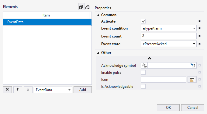
The following properties can be set for each event:
Name | Description |
|---|---|
Activate | Determines whether the event is active or not. |
Event condition | Determines the type (priority) of the event. The icons are arranged according to their priority in a clockwise direction. Top right is the highest priority. |
Event state | Current state of the event. |
Event count | Determines how many events of this type and state are active. |
Acknowledge symbol | Writes TRUE to the symbol when the event is pressed. |
Is Acknowledgable | Determines whether the event can be pressed. |
Icon | Icon to use if no event condition is selected to allow user specific icons. |
Enable pulse | Evaluation is done only if Event condition and Event state are not used. When activated, a red pulse is displayed around the UiIcon. |
ShowDisplays
tchmi:general#/definitions/BooleanDetermines whether the displays defined in the attribute DisplayData are shown or not.
PopUp
ShowFaceplate
tchmi:general#/definitions/BooleanDetermines whether a pop-up is opened when the UiIcon is clicked.
| If the attribute is not activated, the UiIcon can, for example, be used for navigation to another content but still display events of the linked BaObject. |
Connections
Connections can be used to represent connections to other lines in a P&I diagram.
tchmi:framework#/definitions/PaddingConnections can be created here that extend vertically or horizontally away from the UiIcon.
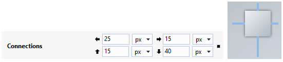
The length of the connection must be specified in each case.
| The unit pixel is always used. Percent is not supported at this point. |
ConnectionExtensions
tchmi:framework#/definitions/PaddingHere extensions can be created for the connections created above.
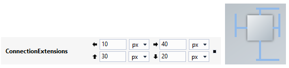
The length of the extension must be specified in each case.
| The unit pixel is always used. Percent is not supported at this point. |
ConnectionsWidth
tchmi:framework#/definitions/PositiveNumberSpecification of the width in pixels for the connections.
ConnectionsColor
tchmi:framework#/definitions/SolidColorSpecification of the color for the connections.
ConnectionsColorPerSide
tchmi:framework#/definitions/TcHmi.BuildingAutomation.FourSidedColorDefines the color for different connections. The ConnectionsColor attribute must be set to NULL or NONE.