Button
The button is essentially the same as the TcHmiButton. The only difference is extended functionalities for the icon, because the options of the icon package can be used here.
Use
Can be used wherever a button with extended icon functionality is required.
Features
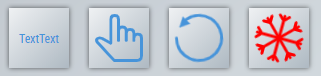
Provides advanced functionality for icons from the NuGet package TcHmiBa.Icons.
Attributes
The control inherits from TextControl and thus has the same attributes. In addition, there are the following attributes.
Icon
Icon
tchmi:framework#/definitions/PathPath to the icon.
IconWidth
tchmi:general#/definitions/NumberWidth of the icon.
IconWidthUnit
tchmi:general#/definitions/MeasurementUnitUnit of the width of the icon.
IconHeight
tchmi:general#/definitions/NumberHeight of the icon.
IconHeightUnit
tchmi:general#/definitions/MeasurementUnitUnit of the height of the icon.
IconHorizontalAlignment
tchmi:general#/definitions/HorizontalAlignmentDefinition of the horizontal alignment of the icon within the button.
IconVerticalAlignment
tchmi:general#/definitions/VerticalAlignmentDefinition of the vertical alignment of the icon within the button.
IconRotation
tchmi:general#/definitions/NumberDetermines by how many degrees the icon should be rotated.
IconRotationSpeed
tchmi:general#/definitions/NumberDetermines the speed at which the icon should rotate.
IconRotationDirection
tchmi:general#/definitions/TcHmi.BuildingAutomation.Controls.DirectionDetermines the direction in which the icon rotates if the attribute IconRotationSpeed is defined. The default value is clockwise.
IconOverlays
tchmi:framework#/definitions/TcHmi.BuildingAutomation.Controls.Common.Icon.OverlayListDefines overlays of the icon.
Legend
ShowInLegend
tchmi:general#/definitions/BooleanSpecifies whether the icon is visible in the legend.
Category
tchmi:general#/definitions/StringSpecifies the category of the icon in the legend.
Description
tchmi:general#/definitions/StringSpecifies the description text of the icon in the legend.
Events
Event | Description |
|---|---|
onButtonPressed | Triggered when the button is pressed. |
onButtonDoublePressed | Triggered when a double click on the button has been performed. |