ProjectNavigationTextual
The ProjectNavigationTextual is one of the generic controls and is used to navigate through the project structure of a device. It provides information about the type (e.g. Analog Input or Structured View) [1], the description [2], the value [3] and the events (if available) [4] of the objects.
 | Here you will find more detailed information about the generic possibilities of TcHmiBa and how they can be used. |
Use
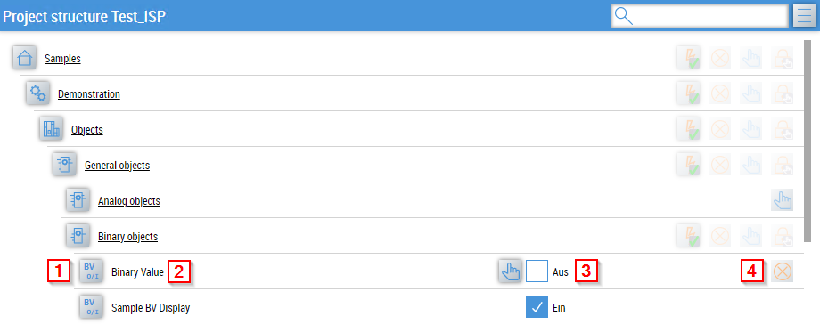
To navigate, the BaObject attribute must be linked. If a BaView is linked, you can navigate through its children. If only a single BaObject (no BaView) is linked, then only one entry is displayed with this BaObject.
Features
Generic navigation
The navigation is built generically based on the structure of the linked BaObject or BaView, which means that all BaObjects of a BaView can be reached with just one binding.
Manual override
The value display and manual override is realized with the ManualOverride control.
Link content page
The function for linking content pages is an additional navigation aid.
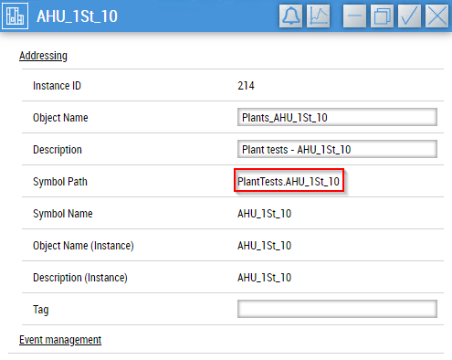
A content page must exist in the TcHmi project that has the Symbol Path of a view as its name.
| The name of the content page is case-sensitive. |
A button then appears behind the relevant entry in the project navigation.
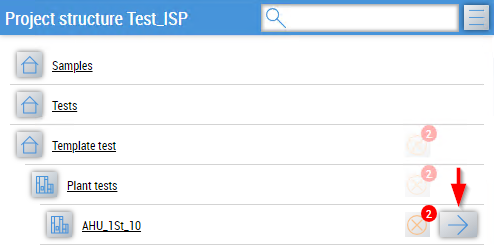
In addition, a TcHmiRegion with the name TargetRegion must exist in the TcHmi project in order to display the linked content page.
Header
The header contains an input field for searching the listing and a burger menu for displaying additional actions.

Actions:
- Selection of labels to be displayed for the entries
- Opening the trend configurator
- Opening generated trend configurations
Parameter dialog
After clicking on the type icon, the parameter dialog of the selected BaObject appears.
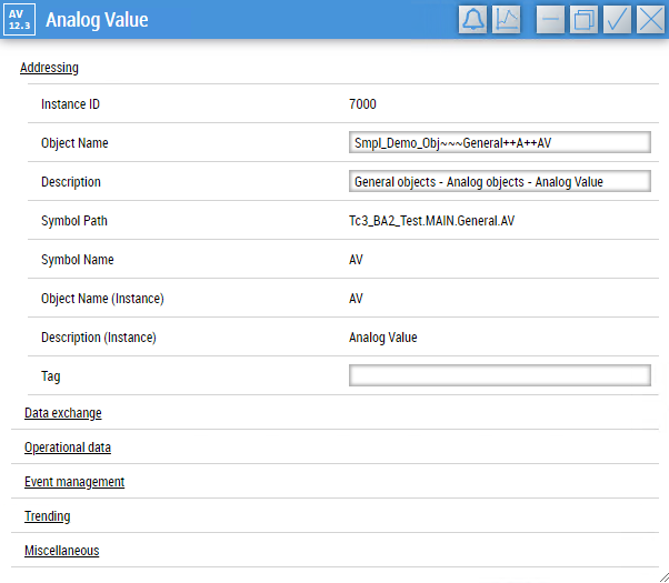
The parameters listed are divided into categories. Visibility and permitted read/write accesses depend on the role of the logged-in user.
Changes to parameters are written to the PLC with the tick icon and discarded with the cross icon.
| The category assignment and visibility of the parameters can be set globally (see Global settings). |
Depending on the BaObject selected, additional buttons may appear in the header.
Buttons:
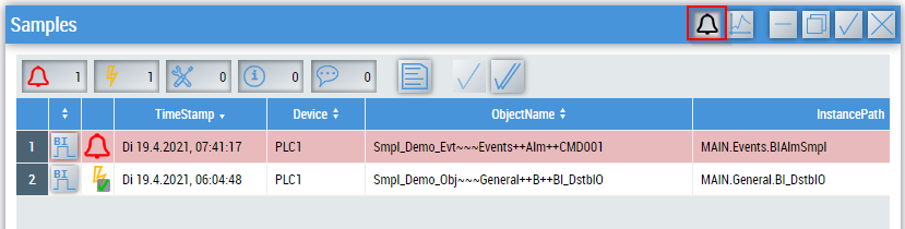
- Event bell
- available for every event-capable object
- replaces the content of the window with the event list of the object when clicked
- Trend functionalities
- only available for objects that support them or views that contain objects with trend functions.
Attributes
The control inherits from BaseControl and thus has the same attributes. In addition, there are the following attributes.
BA
BaObject
tchmi:framework#/definitions/SymbolSymbol for BaObject for using the generic functionalities of TcHmiBa. Links a single object or a complete view (including children) to the control.
| The attribute is not applicable to all controls. |
Common
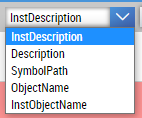
BaUsedTitle
tchmi:framework#/definitions/TcHmi.BuildingAutomation.Controls.ProjectNavigationTextual.BaUsedTitleDetermines which parameter is used for the description in an entry. The setting can be customized in the client.
Show Header
tchmi:general#/definitions/BooleanDetermines whether the header is displayed or not.
AutoCollapse
tchmi:general#/definitions/BooleanDetermines whether list entries are automatically closed when another list entry is selected.