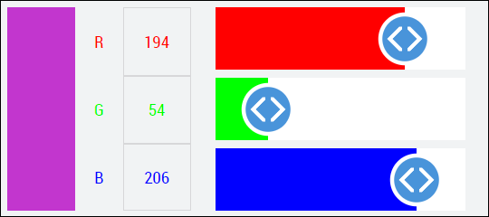
Color
The Color Control TcHmiVnColor displays colors and makes them adjustable if necessary. It contains various display elements to represent the color values, which, depending on the configuration, can also be used to set the color values. An overview of the components and the set-up can be found in the Display elements subchapter. The description of each configuration option can be found under the following categories on this page. For each category there are sub-chapters with further information, details and application examples.

 | For all the following attributes, the control has a getter and a setter method. For example, for the attribute All further attributes, events and permissions provided by the Controls base class can be found in the TwinCAT HMI documentation. |
Category: Common
The following attributes represent a data interface for the color value of the control. It is used on the one hand to set the displayed color of the control, and on the other hand to retrieve a color value entered by the user.
Attribute | Type | Description |
|---|---|---|
| HMI symbol containing the current color value. | |
| Defines the format of the color. This includes:
| |
|
| Function that converts the respective color value into a string that can be interpreted by the browser and vice versa. This is necessary to tell the control the meaning of each color channel if it differs from the default RGB format. |
| Color value. This can be retrieved without a symbol being linked as |
The ColorValue attribute always adapts to the data type of the mapped PLC variable. The default is a 4-channel array (TcVnVector4_LREAL) which is also used without mapping. For more options, see Linking with PLC.
Function | Description |
|---|---|
| Sets the color value. Can be called without a symbol being linked as |
Category: Usage
The following attributes specify the behavior of the control.
Attribute | Type | Description |
|---|---|---|
| Determines whether the color box is displayed and whether it is editable. | |
| Determines whether the individual color values are displayed and whether they are editable. | |
| Determines whether the individual color values are displayed as sliders and whether they are editable. | |
|
| Specifies whether the color symbol should be updated during |
Category: Appearance
The following attributes determine the appearance of the control.
Attribute | Type | Description |
|---|---|---|
| Orientation of the control; analogous to the orientation of the LinearGauge controls. | |
|
| Determines the width or height of the color box depending on the orientation (value of Orientation). |
|
| Determines the width or height of the displayed color names depending on the orientation (value of Orientation). |
|
| Determines the width or height of the displayed color values depending on the orientation (value of Orientation). |
Events
All events are listed in the "Vision" category.
Event | Description |
|---|---|
| This event is triggered as soon as the |
Themed Resources
The following attributes can be used to change the appearance of sub-controls (the text boxes for the color values and channel names) at the Themes settings. A detailed description of the individual attributes can be found in the standard HMI documentation.
Attribute | Type |
|---|---|
|
|
|
|
|
|
|
|
|
|
|
|