Table
A table can be added in the visualization, in order to display one- or two-dimensional arrays, structures or local variables of a POU. An example of the configuration of a table can be found in the section "Configuration of a table".
Properties editor
The properties of a visualization element - except alignment and order - can all be configured in the properties editor. By default, this editor opens next to the visualization editor, or it can be opened explicitly via the "Properties" command (which can be found in the View menu as standard).
A property can be modified by editing the field "Value". To this end, an input field, a selection list, a dialog or checkbox that can be activated is provided in this field, depending on the element type. The value field opens
- after a double-click,
- after a single click in a selected field,
- via the space bar, if the field was already selected.
If a variable is assigned,
- simply enter its name.
- Use the
 button to open the input assistant for selecting a variable. The Variables category lists all variables that have already been defined in the project.
Working in the list of properties can be made easier with the aid of default, sorting and filter functions.
Element properties
All element properties and their descriptions are listed below.
Element name | The element name can be changed. Standard name is "GenElemInst_x". "x" stands for a sequential number. |
Element type | The element type is entered here. For three element groups it is possible to switch between the corresponding elements by changing the element type: |
Additional settings
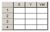
Data array | This parameter is used to specify the variable to be visualize, complete with the full path. The structure of the variable determines the number of columns and rows in the table. Use "Max. Array-Index" if the number of array elements for the variable varies. To update the table, if the size of the array or structure variables has changed, place the cursor into the data array value field and press the Enter key. Example: The following array forms a table with three columns and four rows. aData : ARRAY [1..3,1..4] OF INT; |
Max. array index | Numeric variable, which dynamically specifies the maximum array index, in order to avoid the array limits being exceeded |
 | If the data array value is changed, i.e. if a new variable is assigned, the other table properties are reset to their default values. |
Columns
The table element visualizes a variable in table view. The index of the array/component of the structure is shown in a column/row. For two-dimensional arrays or an array of structures the visualization uses several columns. In these element settings the appearance of the table columns is defined, in which the values of the individual array elements/ structure components/ variables are displayed. Each column pertaining to a certain index can be configured individually.
Columns
| The variable structure defined under ‘Data array’ is used to determine the number of columns and assign the index <n>. Example: aDataArray1 : ARRAY [2..8] OF INT; → A column [0] is formed. aDataArray2 : ARRAY [1..3, 1..10] OF INT; → Three columns are formed [0], [1] and [2]. |
Show row header | If this option is enabled, the row labelling is displayed in the form of assigned row indices. |
Show column header | If this option is enabled, the column labelling is displayed in the form of assigned row indices. |
Row height | Row height in pixels |
Width of row header | Width of the column containing the row header, in pixels |
Size of the scrollbar | Width of the vertical or the height of the horizontal scrollbar in pixels |
Column [<n>]
Column heading | Here you can change the column heading by entering a new title. By default the name of the array or structure with the index or structure component pertaining to the column is used as heading. |
Width | Column width in pixels |
Image column | If this option is enabled, this column is used to display images from the global image pool or from user-defined image pools. The values in the table cells specify the ID of the image in the image pool. |
Image configuration
| The following configurations can be implemented here:
Fill cell: The image is adjusted to the cell size, irrespective of the width/height ratio. Centered: The image is centered while maintaining the proportions within the cell. The width/height ratio is maintained, even if the height or width is adjusted individually.
If this option is enabled, the color set under transparency color is made transparent.
Here you can select a color from a selection list or via a color selection dialog, which can be opened via the |
Text alignment of the heading | Here you can modify the alignment of the column header:
|
Use template | If this option is enabled, a further visualization element (of type rectangle, rounded rectangle or ellipse) is added in each cell of this table column. The property list is automatically extended with the properties of this element from the template. |
Text alignment of the heading from the template | If this option is enabled, the settings for font (size) and alignment from the inserted template are also applied to the column heading. Enabling this option only takes effect if ‘Use template’ is enabled at the same time. |
Template | Under Template the properties of all elements assigned to the column are listed successively and can be edited as described under rectangle, rounded rectangle or ellipse. This entry only exists if "Use template" is enabled. |
Position
Here you can define the position (X/Y coordinates) and size (width and height) of the element in pixels. The origin is in the top left corner of the window. The positive x-axis is on the right, the positive y-axis runs downwards. If the values edited, the displayed element is simultaneously modified in the visualization editor.
X | Horizontal position in pixels – X=0 is the left edge of the window. |
Y | Vertical position in pixels – Y=0 is the upper edge of the window. |
Width | Width of the element in pixels |
Height | Height of the element in pixels |
Text properties
These properties are used for a static definition of the font. A dynamic definition of the font is possible in the category "Font variables".
Horizontal alignment | Defines the horizontal alignment of the text through selection of:
|
Vertical alignment | Defines the vertical alignment of the text through selection of:
|
Text format | Defines the display of a text that is too long to be displayed completely in an element:
|
Font: | Defines the font through selection from predefined fonts:
Press |
Font color | Defines the font color for the element. Either from the selection list or via the dialog that opens when |
Dynamic texts
These parameters are used to define dynamic texts originating from text lists. This enables language change, for example.
A further possibility to define a text dynamically is to supply the text via a string variable. (see the category "Text variables")
Text list | Name of the text list, as used in the project tree, as a string Example: 'TL_ErrorList' |
Textindex | Index (ID) of the text, as defined in the text list, as a string. It can be specified directly in a static manner or as a string variable. |
Tooltipindex | Index (ID) of the tooltip text, as defined in the text list, as a string. It can be specified directly in a static manner or as a string variable. |
Font variables
These variables are used for dynamic font definitions for element texts via project variables. Static definitions are configured under "Text properties".
Font name | Specification of a variable of the type String that contains the font name that is to be used to label the element. (name specified as in the standard font dialog) Example: MAIN.sFont (sFont := ‘Arial’;) |
Size | Variable of type INT containing the size of the element text in pixels, as in the default dialog ‘Font’. Example: MAIN.nHeight (nHeight := 16;) |
Flags | Variable of type DWORD for defining the font display via one of the flag values listed below. A combined definition can be achieved by adding the respective flag values and specifying the sum.
Example: MAIN.nFlag (nFlag := 6;) The text is shown bold and underlined. |
Character set | The character set to be used for the font can be defined via the default font number. This number can be specified via a DWORD variable (see also the definition in the default font dialog) |
Color | Variable of type DWORD for defining the color of the element text. |
Flags for the text alignment | Variable of type DWORD for defining the text alignment via one of the flag values listed below. A combined definition can be achieved by adding the respective flag values and specifying the sum.
Example MAIN.nFlag (nFlag := 5;) The text is displayed centered horizontally and vertically. |
State variables
These are dynamic definitions of the availability of the element in online mode.
Invisibility | Specification of a boolean variable. If this returns TRUE, the element is invisible in online mode. |
Input disabled | Specification of a boolean variable. If TRUE is returned, inputs for the element have no effect. Also, the element itself is greyed out in the visualization, to indicate that no user inputs are possible. If the visualization uses the user management, the elements for user groups with access right "only visible" are grayed out. |
Selection
|
Selection color |
Fill color for selected table cells |
|
Selection type |
This parameter is used to define how the selection is made when a table row is clicked:
|
|
Frame around selected cells |
If this option is selected, a frame is drawn around the selected cells. |
|
Variable for column selection |
Variable of the type Integer in which the index of the column of the selected cell is stored. In case the data array points to a structure, the structure components are indexed, beginning with 0. Note that this index only then represents the correct position in the array, if no columns were excluded from being shown in the table. |
|
Variable for row selection |
Variable of type integer, in which the index of the row of the selected cell is stored |
|
Variable for validity of the column selection |
Boolean variable, which is TRUE, if the variable for the column selection contains a valid value |
|
Variable for validity of the row selection |
Boolean variable, which is TRUE, if the variable for the column selection contains a valid value |
Access rights
This setting relates to the access rights for the individual element. Click to open the Access rights dialog. The setting is only available if a user management was added to the PLC project. The following status messages are available:
Not set. All rights. | The default message is set, if the element is shown as available for all groups. |
Rights are issued: Limited rights. | The message is set, if the element is shown with limited behavior for at least one group. |