Configuring a table
First, the variable to be visualized in the variable has to be specified. To this end, enter a variable with full path in "data array". The structure of the variable determines the number of rows and columns in the table. For two-dimensional arrays, the first index determines the number of columns, the second index the number of rows. For a structure, the individual components represent the structure of the columns:
- Example 1:
aDim1 : ARRAY [2..5] OF INT;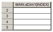
- Example 2:
aDim2 : ARRAY [0..2, 0..3] OF INT;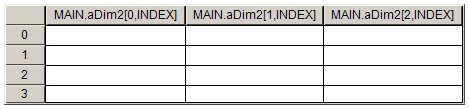
- Example 3:
TYPE ST_ProductInformation :
STRUCT
    nOrderInPieces : INT;
    bStocked : BOOL;
    nArcticelNumber : INT;
END_STRUCT
END_TYPE

stProductInformation : ST_ProductInformation;
- Example 4:
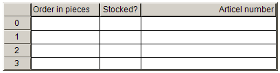
aProductInformation : ARRAY [0..3] OF ST_ProductInformation;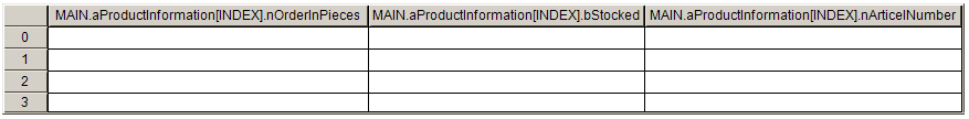
- Example 5:
fbTimer : TON;
- Example 6:
aTimers : ARRAY [0..3] OF TON;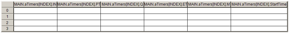
 | If the entry in the field "data array" is changed, all other settings for the element properties are reset to their defaults! |
Example 4 is used below.
Once a variable has been entered in "data array", the properties for each individual column can be changed. First, the column headers are changed to make them more meaningful. Next, the column width and the header alignment are changed.
Two options are available for changing the column width:
- In the element properties, under the respective column the value can be changed in the property "Width".
- Directly in the table elements, the mouse can be moved to the line between two columns. A cursor icon appears
 , which indicates that the size of the column can now be changed while the mouse button is pressed.
The row height is set to 25 pixels in property "Row height". The following image shows the wider scrollbar. The size can be set under "Scrollbar size". The scrollbars are added to the table, when the table is reduced to a size that is less than the sum of the row heights or column widths.
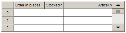
The scrollbars can be removed again by adjusting the table size. The height is calculated from the row height multiplied with the number of rows (+1 if the column header is enabled). The width is the sum of the individual column widths plus the width the label column, if this is enabled.
The text font and size can be selected the dialog box that opens by clicking on the  button in "Font". In the example the font color under "Font color" is changed to "Blue".
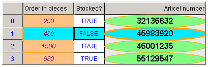
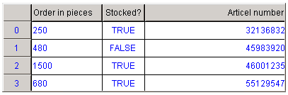
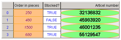
At runtime, the table looks as follows:
| Note that the horizontal alignment of the cells is specified in the settings for the respective columns under "Text alignment of the heading". Except in cases where a template is used on a per column basis, as described below. |
The table fields can be edited column by column. To this end, tick the checkbox "Use template" for the selected column, whereupon "Template" is added as a further item in the column properties and expanded.
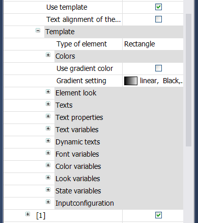
Three different template types are available for selection. "Rectangle" is entered by default. However, this can be changed to "rounded rectangle" or ellipse" by clicking inside the value field of the property "Element type". The corresponding configuration options show the element properties of the selected template. As usual, you can select the fill and frame colors for normal and alarm state, which can also be switched via a variable. The alignment of the entries in the column cells (except the header cells) is now determined by the setting in the template.
| Instead of array components entered by default, any other project variable can be entered under "Text variable". In particular, this enables the array elements to be displayed in a different order in the table. |
| The columns can also be swapped within in the table. To this end, click on the center of a column within the header and drag the column to its new position while pressing the mouse button. |
In this example, a template was used for the first and third column.
To make a selection for a cell visible, the settings are then adjusted under "Selection". Initially the color is set to "light blue", the selection type to "row selection". If a cell is selected at runtime, all other cells in the current row are also highlighted.