Shapes
The attributes and functions explained on this page can be found in the Shapes category.
A common use case is the selection of certain image areas by the user. This can be a region of interest or the position of an object. Another related use case is user-defined measurement of distances or areas within an image.
To accommodate all these use cases, the properties in the Shapes category offer flexible functionality for drawing and editing different shapes on the image and retrieving their respective geometric descriptions.
Property: ShapeSelectionActive
The selection of a shape can be activated via the ShapeSelectionActive property or via the Shape button in the Toolbar. As long as this property is active, the shape can be drawn by clicking on the image surface and edited by dragging and dropping the corner points or the shape itself. If this property is set to false and the ShapeAutoClear property is active, the current shape will be reset and lost, so any data needed must be extracted first.
The geometric description of the drawn shape can be retrieved via the ShapeData property. Depending on the ShapeType property (see below) the shape data have a different format. You can expect exactly the same format used in the interactive controls themselves (for example, TcHmiVnPolygon and TcHmiVnRectangle), because the symbol is bound directly to the shape control used internally. The ShapeLimitToImage property can be used to restrict the shape to the image area. If this is not the case (default), please note that the shapes can also assume negative values. The shapeIsInImageArea function can be used to query whether the shape is located within the image.
Properties: ShapeType und ShapeData
Different types of shapes are available, based on two different data types. You can select one of the following shapes using the ShapeType property:
ShapeType | ShapeData | PLC Declaration |
|---|---|---|
Point | [[x, y]] |
|
Line | [[x1, y1], [x2, y2]] |
|
Square, Rectangle, Circle, Ellipse | { fAngle: angle, aCenter: [cx, cy], stSize: { fWidth: width, fHeight: height, }, } |
|
Polygon | [[x1, y1], [x2, y2], …, …, [xn, yn]] |
|
The values in ShapeData refer to the image coordinates of the original image.
 | Since the shape types square and circle always have the same height and width by definition, they will not be drawn exactly to this endpoint when the second position is clicked if the aspect ratio is not the same. In this case, the desired position can be reached by moving the corresponding corner. |
The ToUprightRectangle conversion function is available to transfer the data of the shape types Square and Rectangle of type TcVnRotatedRectangle directly to a PLC variable of type TcVnRectangle_UDINT or a TcVnRectangle and use it as an upright bounding rectangle without a rotation angle. For the opposite case there is the ToRotatedRectangle function.

Programmatically, the ShapeData property can be changed via Java script as follows:
let control = TcHmi.Controls.get("TcHmiVnImage")
// Polygon with 4 Points
control.setShapeData([[10, 10], [10, 100], [150, 150], [100, 10]])

// Rectangle
control.setShapeData({"aCenter":[200,200],"fAngle":15,"stSize":{"fWidth":150,"fHeight":150}})
In the first sample, a polygon with an array of 4 points is written. To write a point you need only the first element and for a line the first two. In the second sample, a rectangle is written. Since the shape types square, circle and ellipse are based on the same data type, the same notation can be used for these types as well.
The data can also be written to ShapeData via WriteToSymbol action. To do this, copy the part inside the round brackets of the setShapeData() function and paste it as an object value.
Property: ShapeAutoClear
If the ShapeAutoClear property is active and the ShapeType is changed while ShapeSelectionActive is true, the current shape is reset and a new shape of the selected shape type can be drawn. If ShapeAutoClear is not active and you switch between shape types of the same base control, the data is retained when the ShapeType is switched and the new shape is displayed directly. The point, line and polygon types belong to one group that use the same base control, while the square, rectangle, circle and ellipse types belong to the other.
Appearance
The appearance of the shape and the control points can be changed by adjusting the color and size/thickness of the contour:
- With
ShapeStrokeThicknessyou can set the thickness of the lines in pixels. - With
ShapeHandleSizeyou can set the size of the displayed control points of the shape in pixels - With
ShapeClickableSizethe size of the clickable area of a control point can be set in pixels. This can simplify operation on touch panels without having to display the handles unnecessarily large. - Via
ShapeStrokeColorandShapeHandleColorthe color of the lines and that of the control points can be set independently.
Property: ShapeIsRotatable
If ShapeIsRotatable is active, an additional handle is displayed for suitable shapes (line, rectangle, square, ellipse, polygon), with which the shape can be rotated. Using the ShapeAngleInterval property, the step size in which the rotation of the shape can be changed can be set in degrees. With the default value 0°, the shape can be rotated as desired. For example, if the shape may only be placed in 4 positions, you would enter 90° as the value.
Property: ShapeLimitToImage und ShapeIsInImageArea
It is often necessary for a shape to lie completely within the image, e.g. to be able to set a region of interest. If the ShapeLimitToImage property is active, a shape can only be drawn and moved within the image. This restriction does not affect the programmatic setting of a shape, but only graphical interactions. It should also be noted that if ShapeIsRotatable and ShapeAngleInterval are set, the shape can still be rotated without restriction.
If ShapeLimitToImage is not active, the positioning of the shape can be queried via the ShapeIsInImageArea property. This only returns true if valid ShapeData is currently available and if all corner points of the shape lie within the image area. The corner points are also used to check the circle and ellipse shapes. To be able to differentiate between a shape that is not present and one that is not in the image, you should also check whether ShapeSelectionActive is set and ShapeData is valid.
Property: ShapeDataUpdate
The ShapeDataUpdate property can be used to specify when the ShapeData property should be updated. If onChanged is selected, ShapeData is continuously updated during a graphical interaction. If, on the other hand, onConfirmed is chosen, ShapeData is only updated at the end of an interaction.
Properties: ShapePolygonNumPoints und ShapePolygonClosed
If the ShapeType property is set to Polygon, the number of points from which a polygon is considered complete can be defined via the ShapePolygonNumPoints property. For example, if three points are specified, the polygon is automatically completed when the third point is drawn. If the default value 0 is used, the number of points is arbitrary. The polygon is then only completed when you click on the first point. The ShapePolygonClosed property can also be used to specify whether the first and last points of the polygon should be connected, i.e. whether the polygon should be displayed closed or not.
Function: clearShape()
The drawn shape can be deleted programmatically by calling the clearShape function.
Display element
To support the use case of measuring distances or areas within the image, the Infobar provides an element for displaying text that represents the currently drawn shape. By default, the coordinate is displayed for the "Point" shape type, the line length for "Line", the number of points for "Polygon" and the area for the "Square", "Rectangle", "Circle" and "Ellipse" shape types. If further or other information is to be displayed, this can be implemented using a separate ShapeValueFormatting function.
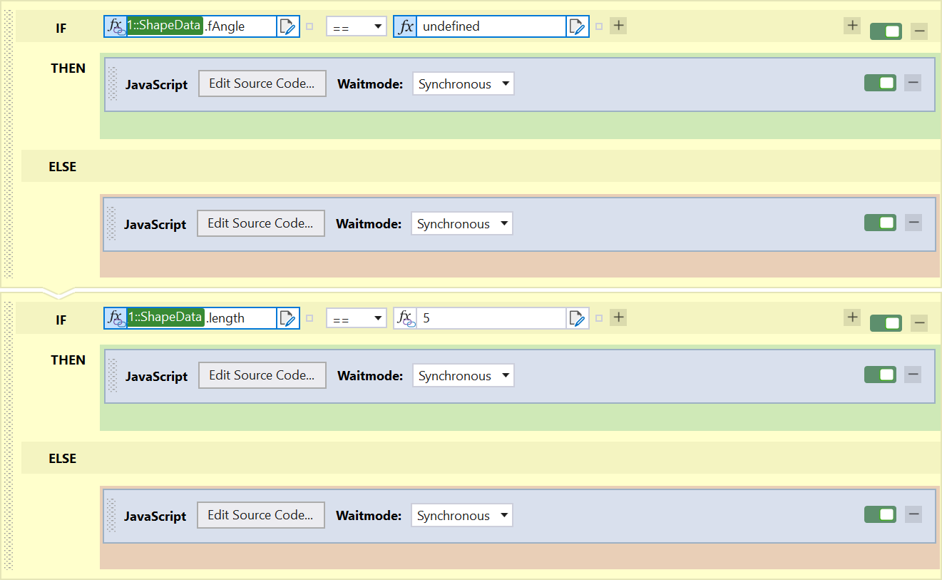
Query the shape types and data values
Depending on the selected shape type, the data in ShapeData can have different formats. To determine which format is present, the current ShapeType can be queried or it can be determined from the data values, e.g. whether the fAngle property is defined. If this is the case, a TcVnRotatedRectangle type is present, otherwise an array of points. To query how many points are contained in the array, the length can be queried. The number can then be used to determine whether there is a point, a line or a polygon with what number of points.
Furthermore, it is possible to check whether valid data are available by querying the individual values. When deleting or resetting the shape data, the individual values are written with 0, which represents an invalid value.
These queries can be used to ensure that the various shape types are each written to a designated PLC variable of the same type and that only valid data can be transferred to the control program.
Events: onShapeChanged und onShapeConfirmed
Both the onShapeChanged and onShapeConfirmed events are available to inform you of a change in shape.
The onShapeChanged event is triggered as soon as ShapeData changes. A change can occur when ShapeData is set programmatically, when the clearShape() function is called and during graphical interactions. This event is used to track the change of ShapeData live, provided that ShapeDataUpdate is set to the onChanged value.
The onShapeConfirmed event is triggered when the shape is set programmatically or after a graphic interaction with the shape has been completed. This event is triggered on the condition that ShapeData is valid.
Advanced use of shapes
The Shape functionality is implemented via separate controls that are integrated into the Image Watch control. These shape controls have some properties that are not directly available from the ImageWatch control. This includes, for example, the exact aspect ratio of a rectangle. These properties can be accessed either programmatically or by using the shape controls separately.