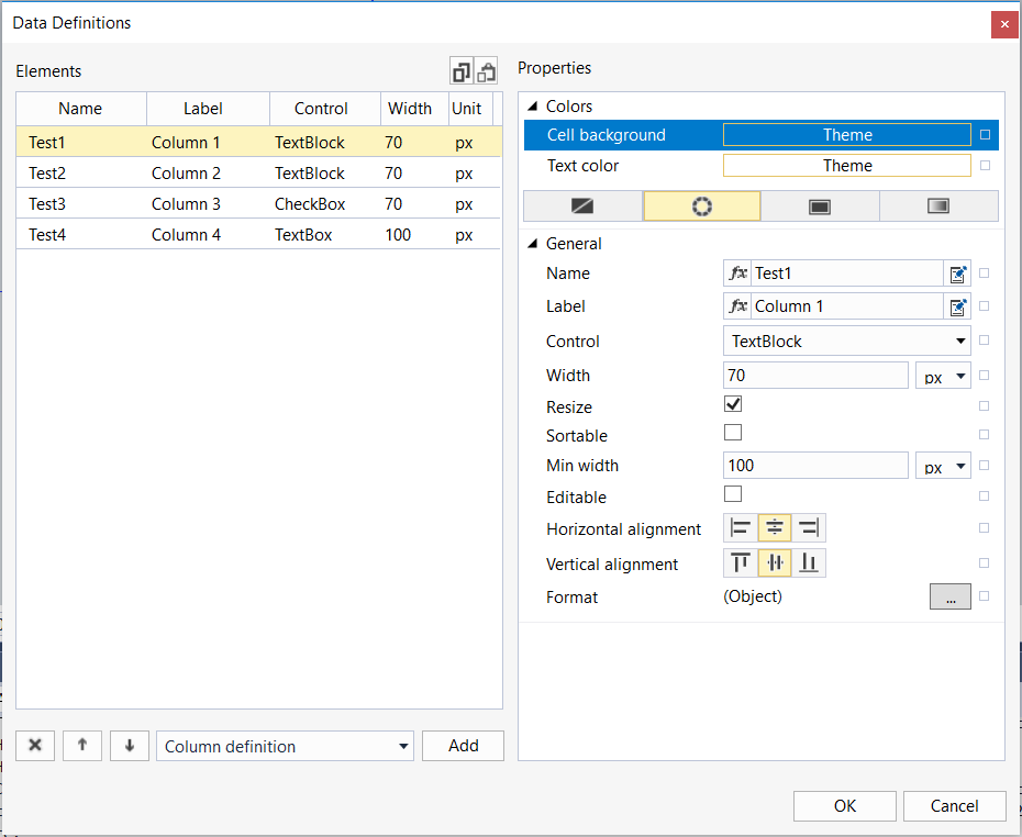
Column Definitions dialog
This dialog can be used to customize the data grid column settings.

Properties | Settings of the column object selected under 'Elements' |
Name | Definition of the name of the structure item to be displayed in this column. The value must match the name of the structure member. Upper and lower case is taken into account. |
Label | Definition of the column header |
Control | Selection of controls to be displayed for the cell: |
Width | Definition of the column width |
Resize | Selecting whether the column width should be customizable by the user |
Min width | Definition of the minimum column width |
Editable | Defines whether the column can be edited. This option has no effect if control is 'TextBlock' or 'Image'. |
Horizontal alignment | Selecting the horizontal alignment of the column contents |
Vertical alignment | Selecting the vertical alignment of the column contents |
Data definitions | Definition of the ComboBox / Image content; this attribute is available once the ComboBox or Image control type has been selected. |
Format | Formatting function that can convert the displayed value. |
Items | List of all objects added |
|---|---|
| Delete the selected object |
| Change the object order (top = left) |
| Add a new object |


