Show image
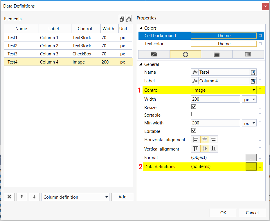
The data grid offers the possibility to display a column as an image.

- Select the "Image" control type.
- Open the "Data definitions" dialog by clicking the "..." button.
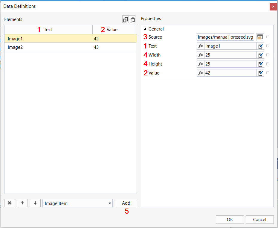
In the "Data definitions" dialog you can add as many entries as you like.

- Text: Name of the image. This property is used for clarity and is not displayed in the data grid.
- Value: Value that controls which image is displayed.
- Source: Path to the image to be displayed.
- Width / Height: Width and height at which the image is to be displayed in the column.
- Add: Adds a new image entry.
After configuration, the column automatically displays the image that is stored for the respective value. The data structure specifies from the outside the value used to load the different images.
The following sample is based on the default configuration of the data grid. The code can be copied under the attribute SrcData:
[
   {
      "Test1": "Example Data",
      "Test2": 42,
      "Test3": true,
      "Test4": "42"
   },
   {
      "Test1": "Example Data",
      "Test2": 3.1415,
      "Test3": false,
      "Test4": "43"
   }
]
This results in the following view:
