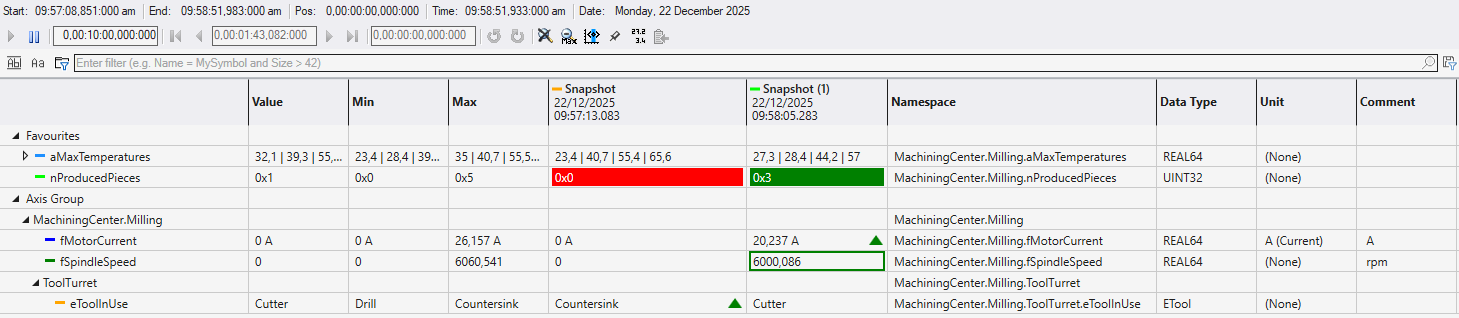
Table Chart
The Table Chart provides a tabular view of channel values, allowing for precise numerical monitoring and comparison. Unlike graphical charts, it focuses on displaying exact values, states, and metadata in a structured grid format. Rows are organized hierarchically with Axis Groups serving as groupings for channels.
Almost all settings can be changed inside the table through context menus and shortcuts.
Rows
Channels are represented by Rows. Adding channels to a Table Chart is designed to be quick and intuitive. You can simply select one or more symbols in the Target Browser and drag them directly into the Table Chart window. When dropped, a new row is automatically created for each symbol, immediately displaying its current value and all relevant properties. When dropped onto the chart a new axis group will be created as well. Dropping onto an existing axis group will add the new channel to that axis group. A new axis group can be added via the context menu, too.
Rows within the Table Chart can be freely reordered using drag and drop. They can be assigned to a different parent axis in the same way as in the Solution Explorer or change order position within one axis group.
Columns
The Table Chart offers several columns to display channel information. Column visibility can be changed through the column’s context menu. Width and order can be conveniently adjusted through the header. These two settings are saved per chart and persist across sessions. The following Columns are available:
|
Column |
Description |
|---|---|
|
Value |
Displays the current value of the acquisition. |
|
Min |
Displays the minimum value of the acquisition in the currently selected time window (not applicable to string acquisitions). |
|
Max |
Displays the maximum value of the acquisition in the currently selected time window (not applicable to string acquisitions). |
|
Namespace |
Shows the full symbol path of an acquisition. This column is not visible by default. |
|
Data Type |
Shows the data type of the acquisition. |
|
Unit |
Shows the unit associated with the acquisition. Units can be selected from a list of predefined units or custom units can be created. |
|
Comment |
Shows any comments of the channel. Comments applied to a symbol in the Target Browser are automatically added to the channel. |
|
Snapshots |
Every snapshot taken adds a new column to the chart. Snapshot columns behave like other columns and can be rearranged and hidden at any time |
 | Only Snapshot columns can be removed from the chart. To hide other columns, use the visibility toggle in the context menu. |
Hierarchy
The Table Chart supports multiple hierarchy display modes that can be configured individually for each axis group, allowing you to control how channel namespaces are visualized. The hierarchy display mode can be changed at any time, directly through the axis group row context menu.
In Full Tree mode, the complete namespace hierarchy is displayed for all channels, providing full structural context. Min Tree mode shows a reduced hierarchy, displaying only the hierarchy levels that are required to organize the channels. When None is selected, channels are displayed as a flat list without any hierarchy grouping.
Hierarchies within the Table Chart can be collapsed or expanded at each level, just like in any tree view. This allows you to focus on specific sections of the hierarchy while hiding others, making it easier to navigate and manage large sets of channels.
Monospace Font
For better readability, especially when comparing numerical values or aligned text, the Table Chart supports a Monospace font mode. When enabled, all characters occupy the same amount of horizontal space. This ensures that digits in vertical columns align perfectly (e.g., units, tens, hundreds), making it easier to spot value changes and compare magnitudes.