CSS theme
Beside the control theme and the class theme there is the possibility to add any number of Cascading Style Sheets files to a theme. A distinction is made between a normal CSS file and a CSS control theme file.
CSS files can also be added at project level, independent of a theme. These files define general properties such as the inclusion of fonts.
Cascading Style Sheets file
A Cascading Style Sheets file allows the definition of any CSS properties for all elements contained in the project (standard controls, framework controls etc.). In addition, specific CSS classes can be overwritten by a control. All CSS selectors and CSS properties are available within a CSS file.
If a class theme is defined in the theme editor, it can be addressed in the CSS code via the class name with the prefix tchmi-class-. Example:
tchmi-class-myclassthemeclassCSS control theme file
A CSS control theme file can be used to replace specific CSS properties of the base theme. This is made possible by importing all CSS properties of the control into the CSS control theme file of the project.
In the next window you have to select the control for which you want to create a CSS control theme file.
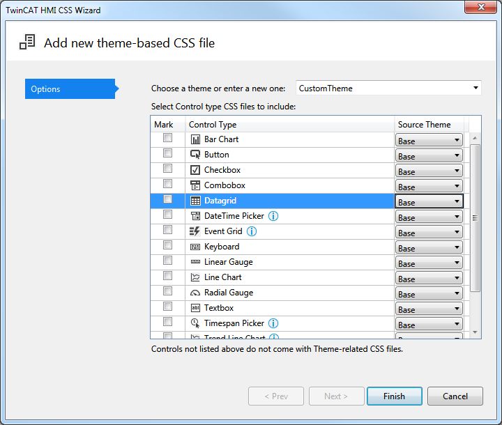
In this dialog you can select several controls for which a CSS control theme is to be generated. You must also select from which theme the CSS control theme should be derived. If you select the Base theme, all properties defined in the Base theme of the control are displayed.
Some controls contain further TwinCAT HMI Controls, e.g. the Event Grid. This is indicated in the dialog by a note (upside down exclamation mark) after the control. If you want to overwrite all properties, you must also include the CSS files of the child controls. For more detailed information about the dependencies between the individual controls, see the documentation for each control.
The following example shows a CSS control theme file for the control TcHmiButton:
/** Styles for the theme: Base */

/* Style for the main element */
.tchmi-button {
   /* color gradient for default view */
   background-image: linear-gradient(135deg, #eff1f3, #aeb9c2);
   /* default color for button text */
   color: #4794da;
   /* default box shadow */
   box-shadow: 0px 0px 5px 0px rgba(0,0,0,0.6);
}

/* class down will be set/unset in the control on mouse/touch down */
.tchmi-button.down {
   /* another color gradient */
   background-image: linear-gradient(135deg, #aeb9c2, #eff1f3);
   color: #000000;
   box-shadow: inset 0px 0px 5px 0px rgba(0,0,0,0.6);
}