Concept
Theming in TwinCAT HMI distinguishes between control-based themes and class-based themes. A control theme specifies properties that apply to all instances of the respective control type. A class theme specifies properties that only apply to controls to which this class is assigned. You can assign several classes to a control.
The theme properties can be set at different levels. Cascading Style Sheets use a comparable approach in the sphere of web development, for example. The levels determine which property applies to an element if different properties are defined for an element. The properties of the higher levels are overwritten by the properties of the lower levels, if these are defined. The lowest level is level 1, which overwrites all properties of the higher levels.
The theme system has the following levels:
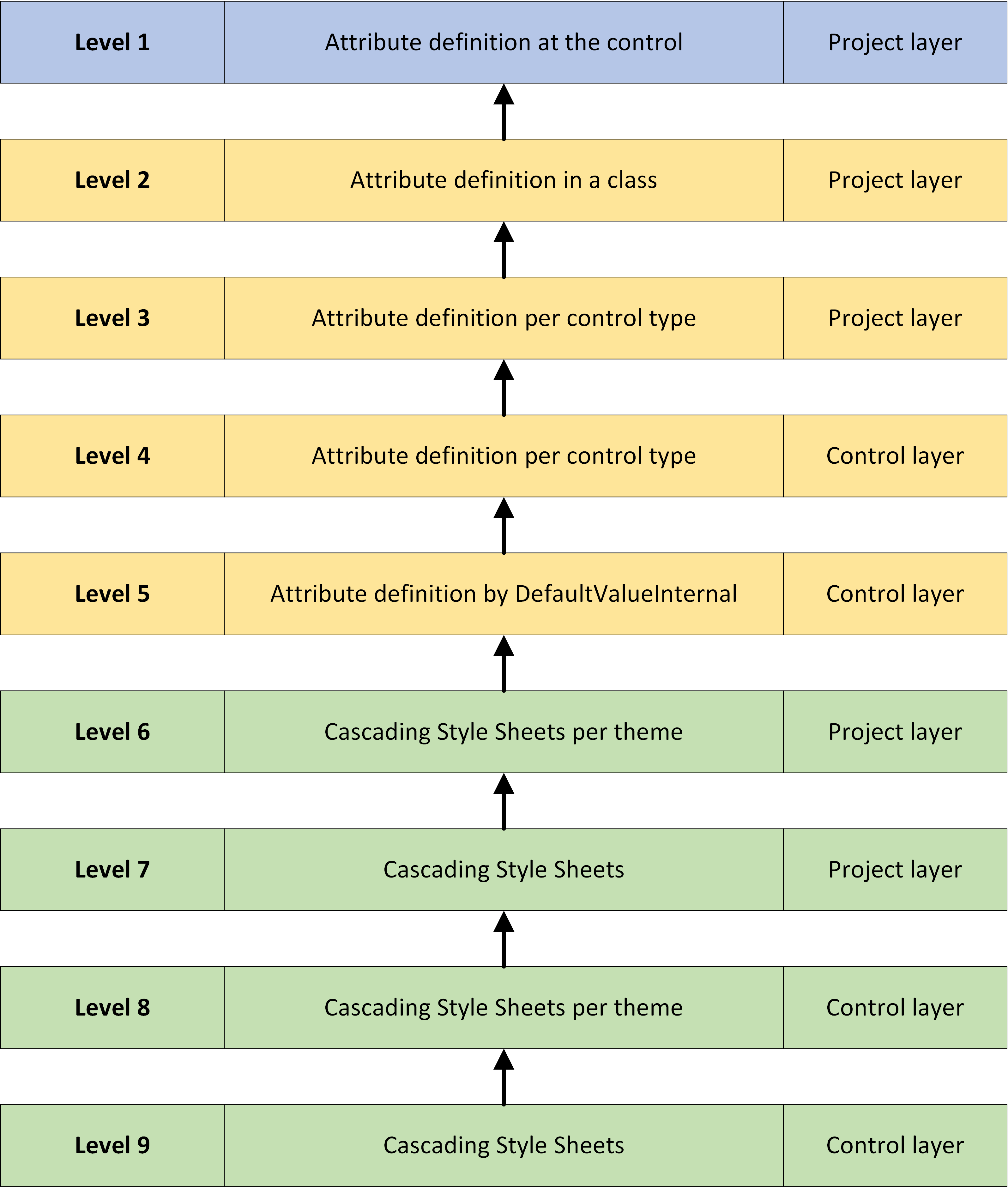
Level 1: Attribute level
This level describes the appearance using attribute definitions at the control. In analogy to the CSS world, this level would be a "style" attribute that is defined directly at the element.
Levels 2-4: attribute levels
Like level 1, these levels describe the appearance using attribute definitions at the control. In analogy to the CSS world, these levels would be external CSS files.
Level 5: attribute levels
Like levels 1-4, this level describes the appearance using attribute definitions at the control. If nothing is specified above levels 1-4, this defaultValueInternal value applies. In the analogy to the CSS world these levels would be comparable to the font color black, for example, which applies even if nothing else has been defined.
Levels 6-9: element levels
These levels describe the appearance of a control using Cascading Style Sheets files if the appearance of a control cannot be defined using an attribute or has not been defined using an attribute.