Control theme
A control theme defines the properties for all instances of a control. The control theme is defined for each theme in the theme editor at project level.
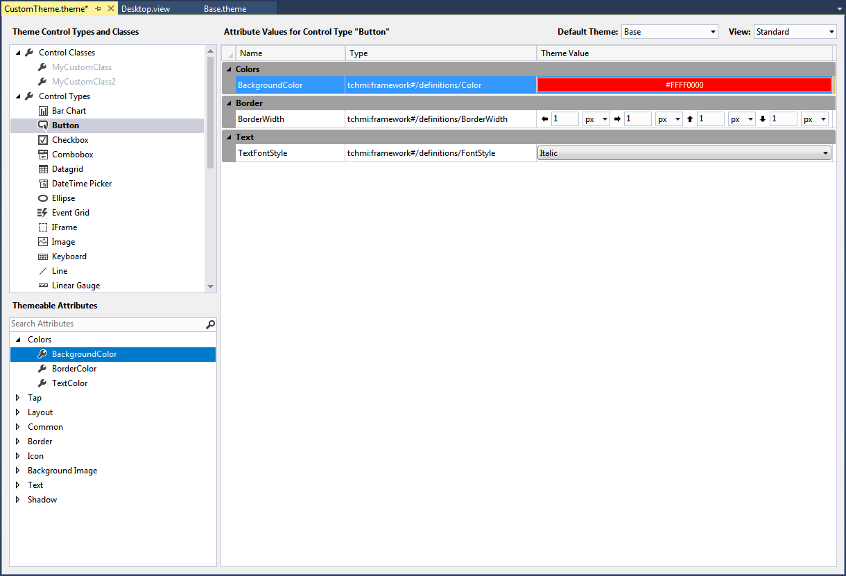
The following steps are required to create a Control theme:
- 1. First, the control type must be selected in the theme editor. In the upper screenshot the control type Button was selected.
- 2. After selecting the control type, select the attribute from the respective changeable attributes.
- 3. Drag and drop the attribute onto the large area for the attribute properties in the center of the editor.
- 4. You can define any number of additional attributes for the control type.
Control types that contains defined attribute properties are shown in bold font. To change the attribute properties for a control type at a later stage, select the respective control type again. The existing configurations are then automatically displayed in the center of the theme editor. A property that has already been configured can be deleted by selecting it and then pressing the Delete key.
 | To display the attribute properties of the Control theme, the attribute must not be explicitly set at the control. The control colors must be set to Theme. |