Checkbox
The checkbox shows or edits binary values.
Use
Can be used on any page where binary values are to be displayed or edited.
Special features
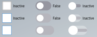
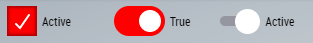
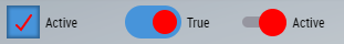
The active and inactive text can be set (e.g. "On" / "Off").
The appearance can be customized using the Appearance attribute.
Possibility to link a BaObject to have to create only a single binding. All the required attributes are then linked via this binding and changes to the value are automatically written back to the PLC.
Attributes
The control inherits from TextControl and thus has the same attributes. In addition, there are the following attributes.
BA
BaObject
tchmi:framework#/definitions/SymbolSymbol for BaObject for using the generic functionalities of TcHmiBa. Links a single object or a complete view (including children) to the control.
 | The attribute is not applicable to all controls. |
Common
ActiveText
tchmi:general#/definitions/StringSpecifies the text that is displayed if State is TRUE.
InactiveText
tchmi:general#/definitions/StringSpecifies the text that is displayed if State is FALSE.
Appearance
tchmi:framework#/definitions/TcHmi.BuildingAutomation.Controls.Checkbox.AppearanceDetermines how the checkbox appears at the top.
Colors
CheckBackgroundColor
tchmi:general#/definitions/SolidColorBackground color of the checkbox if State is TRUE.
| This attribute has no effect if Appearance is set to ToggleSlider. |
CheckmarkColor
tchmi:general#/definitions/SolidColorColor of the check mark or toggle.
BaData
BaInterfaceSymbolNames
tchmi:framework#/definitions/TcHmi.BuildingAutomation.Controls.Common.Checkbox.BaInterfaceSymbolNamesEdit the BaInterfaceSymbolNames.
State
tchmi:general#/definitions/BooleanState of the checkbox.
StateFeedback
tchmi:general#/definitions/BooleanFeedback for the state of the checkbox.
Events
Event | Description |
|---|---|
onStateChanged | Triggered when the value of State has changed. |
onUserInteractionFinished | Triggered when the user interaction with the checkbox has finished. |