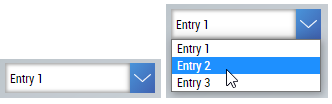
Combo box
The Combobox shows or edits multistate values.
Use
Can be used on any page where multistate values are to be displayed or edited.
Features
Possibility to link a BaObject to have to create only a single binding. All the required attributes are then linked via this binding and changes to the value are automatically written back to the PLC.
Attributes
The control inherits from TextControl and thus has the same attributes. In addition, there are the following attributes.
BA
BaObject
tchmi:framework#/definitions/SymbolSymbol for BaObject for using the generic functionalities of TcHmiBa. Links a single object or a complete view (including children) to the control.
 | The attribute is not applicable to all controls. |
Common
Data
tchmi:framework#/definitions/TcHmi.BuildingAutomation.Controls.Common.Combobox.ComboboxItemsData for the combo box.
Colors
ButtonColor
tchmi:framework#/definitions/SolidColorColor of the button that opens the dropdown list.
ButtonArrowColor
tchmi:framework#/definitions/SolidColorColor of the arrow in the button.
BaData
BaInterfaceSymbolNames
tchmi:framework#/definitions/TcHmi.BuildingAutomation.Controls.Common.Combobox.BaInterfaceSymbolNamesEdit the BaInterfaceSymbolNames.
SelectedData (read-only)
tchmi:framework#/definitions/TcHmi.BuildingAutomation.Controls.Common.Combobox.ComboboxItemCurrently selected data.
SelectedValue
tchmi:general#/definitions/NumberValue of the currently selected data.
UseSelectedValueFeedback
tchmi:general#/definitions/BooleanDetermines whether or not the attribute SelectedValueFeedback is used.
SelectedValueFeedback
tchmi:general#/definitions/NumberFeedback for the selected value.
Events
onChanged
Triggered when the selected value has changed. This happens when the user selects a new entry.
Events
Event | Description |
|---|---|
onSelectedValueChanged | Triggered when the selected value has changed. |
onUserInteractionFinished | Triggered when the user interaction with the combo box has finished. |