Attributes
The attributes listed below are the generally applicable attributes. The attributes introduced specifically for the widgets are described at Widgets.
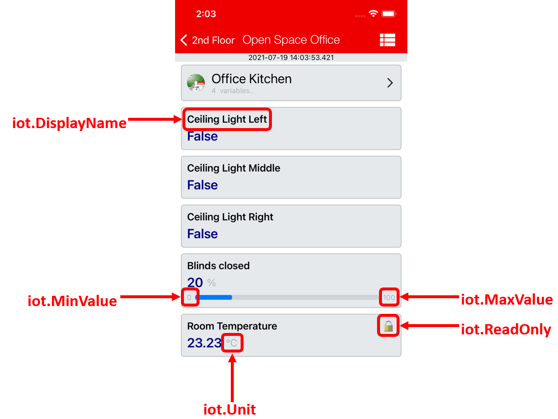
Display name of the variable (iot.DisplayName)
Syntax: {attribute 'iot.DisplayName' := 'Ceiling Lights'}
Defines the name to be displayed in the app for this variable. If this attribute is not specified, the PLC variable name is displayed in the app.
Unity of variable (iot.Unit)
Syntax: {attribute 'iot.Unit' := '°C'}
Defines the unit behind the value of the variable in the app. If this attribute is not specified, the unit behind the value remains empty.
Variable cannot be changed (iot.Readonly)
Syntax: {attribute 'iot.ReadOnly' := 'TRUE'}
Defines whether the variable can be changed from the app. If this attribute is specified with the value TRUE, the variable can no longer be changed, and a padlock symbol appears next to the variable name. If this attribute is not specified, the variable can be changed by default.
User configuration (IoT.PermittedUsers)
Syntax: {attribute 'iot.PermittedUsers' := 'User1,User2'}
By default, every variable (regardless of whether it is a structure or simple data type) can be seen by every user. If this attribute is added, only the specified users can see the variable in their app.
Icons general (iot.Icon)
Syntax: {attribute 'iot.Icon' := 'Room'}
Defines the icon that is displayed on a single variable or on a structure. The TwinCAT cube is displayed by default for structures. The available icons are listed in the List of available icons. The IoT.NestedStructIcon attribute can also be used for structures.
Icon of a nested structure (iot.NestedStructIcon)
Syntax: {attribute 'iot.NestedStructIcon' := 'Room'}
Defines the icon for the start page of a nested structure. The TwinCAT cube is displayed by default. The available icons are listed in the List of available icons.
Minimum and maximum value of the variable (iot.MinValue and iot.MaxValue)
Syntax: {attribute 'iot.MinValue' := '10'} {attribute 'iot.MaxValue' := '30'}
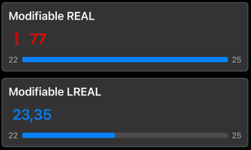
Defines a minimum and maximum value for numerical variables. If both attributes ('MinValue' AND 'MaxValue') are specified, a progress bar in the app shows the progress of the current value with respect to the minimum and maximum value.
Notice | |
Progress indicator The minimum and maximum value define the range covered by the progress bar in the app. The value can be higher or lower than the values specified in the PLC. |
When a value goes leaves its prescribed range, it is highlighted in the app with a value in red. In the following screenshot a value has left its defined range.
Limitation of the decimal places at a variable (iot.DecimalPrecision)
Syntax: {attribute 'iot.DecimalPrecision' := '3'}
Defines a number of decimal places to which a floating-point number is rounded. This setting overwrites any existing app setting for the respective variable. The setting also applies to floating point numbers within widgets.
Changing the text color (IoT.ValueTextColor and IoT.ValueTextColorDark)
Syntax: {attribute 'iot.ValueTextColor' := 'Green'}
Syntax: {attribute 'iot. ValueTextColorDark' := 'Blue'}
Defines a color for the display of a variable value in the app. The function is only supported for simple variable types. Available colors can be found at List of available colors.
The following table lists the different combinations:
Configuration | Effect |
|---|---|
The attribute is not set. | The default color is used. |
Only the ValueTextColor attribute is set. | The set color is used in Light Mode and Dark Mode. |
The attributes ValueTextColor and ValueTextColorDark are set. | The set colors are used in Light Mode and Dark Mode. |
Only the ValueTextColorDark attribute is set. | The set color is only used in Dark Mode; in Light Mode, the default color is used. |
Example
See also: examples > Application sample