Flex container (parent element)
Properties that are set on the parent element initially apply to all child elements. However, individual properties can later be overlayed on the child elements. The parent element properties can be set via FlexLayout (API).
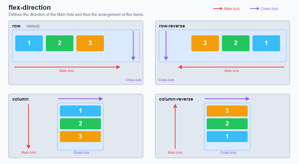
FlexDirection:
Defines the direction of the "Main Axis" and thus determines the direction and order in which flex items are arranged in the container.
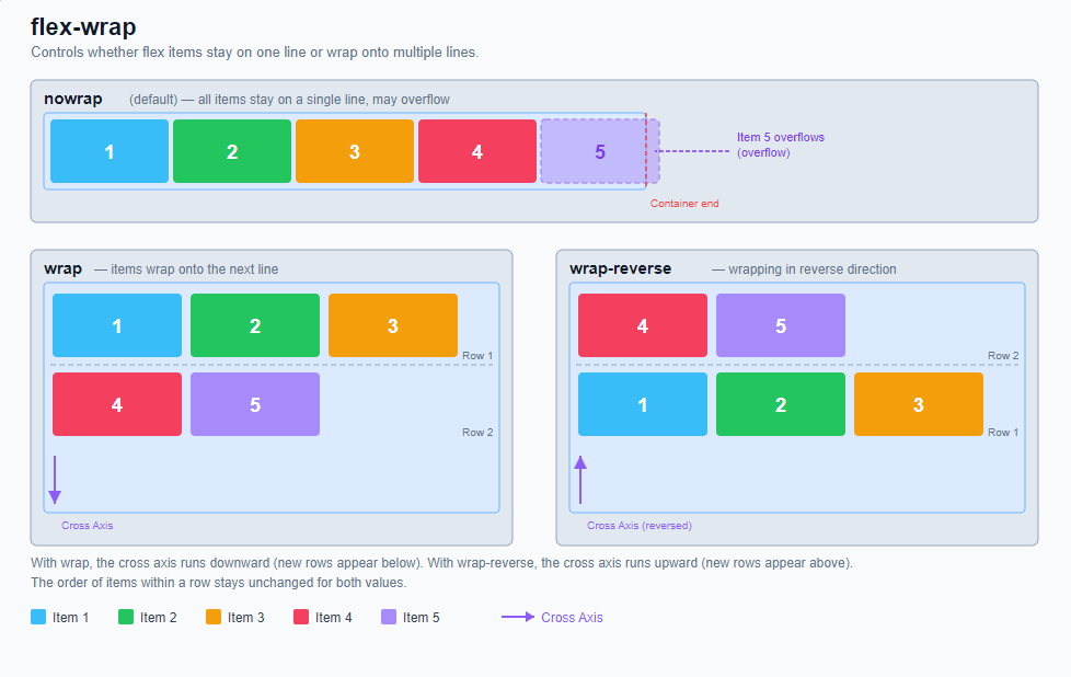
FlexWrap:
Controls whether flex items remain in a single row or are allowed to wrap to multiple rows (or columns for flex-direction: column) if there is not enough space available in the container.
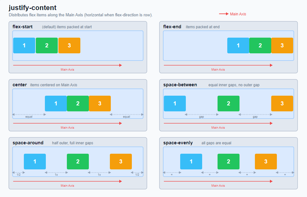
JustifyContent:
Distributes flex items along the "Main Axis". It controls how the remaining free space in the container is distributed - before, between and after the items.
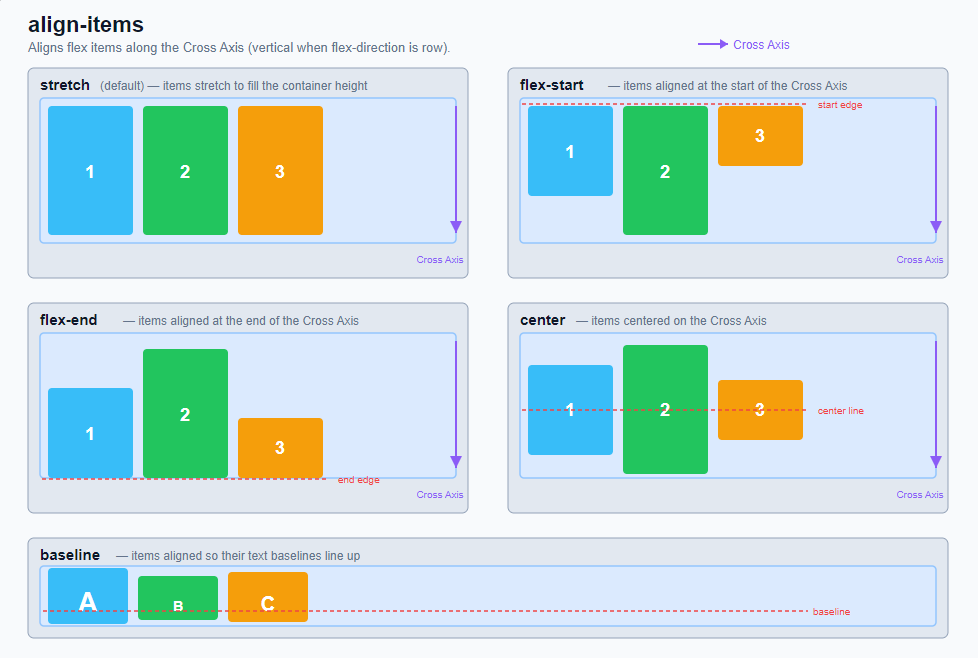
AlignItems:
Aligns all flex items along the "Cross Axis". While "justify-content" controls the distribution along the "main axis", "align-items" determines the alignment perpendicular to it.
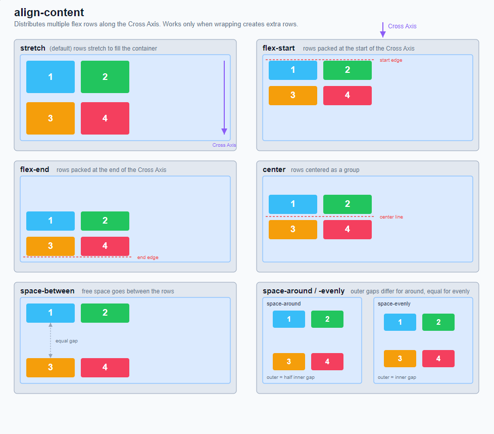
AlignContent:
Distributes "multiple flex lines" along the "Cross Axis". The property only becomes visible when a flex container can actually wrap to several rows or columns using "flex-wrap" and there is free space present along the cross axis.
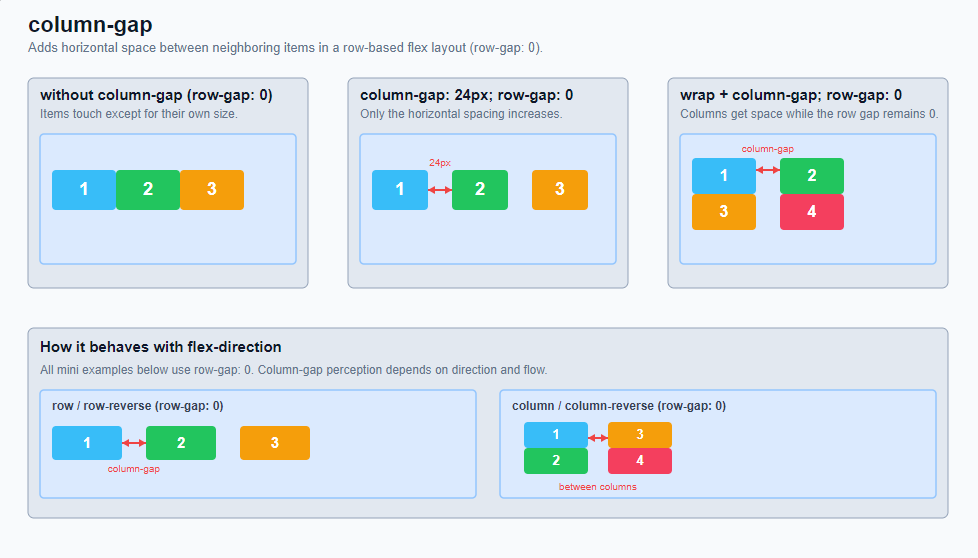
ColumnGap:
Defines the distance between adjacent columns or items in a flex layout. In typical row-based flex containers (flex-direction: row), this is the horizontal distance between adjacent flex items.
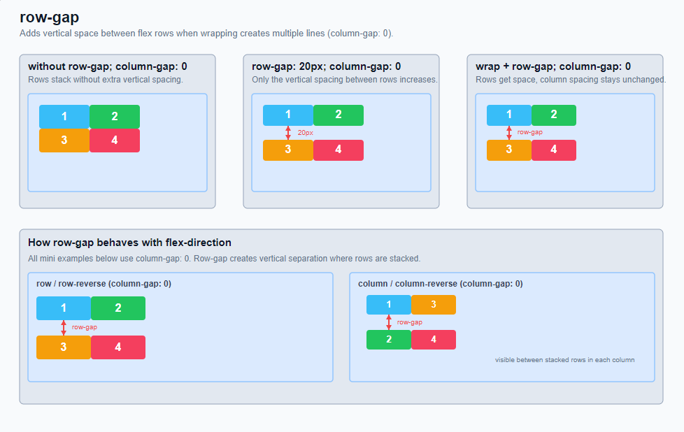
RowGap:
Defines the distance between flex lines. In a classic flexbox layout with (flex-direction: row), this is the vertical space between wrapped rows of items.
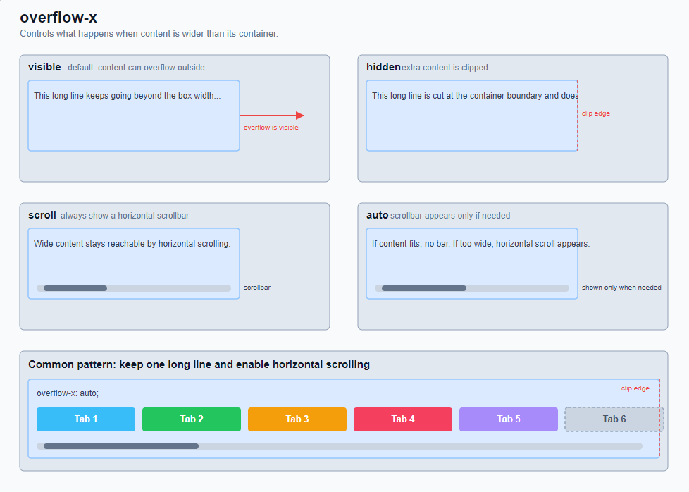
OverflowX:
Controls what happens if the content is wider in the horizontal direction than its container.
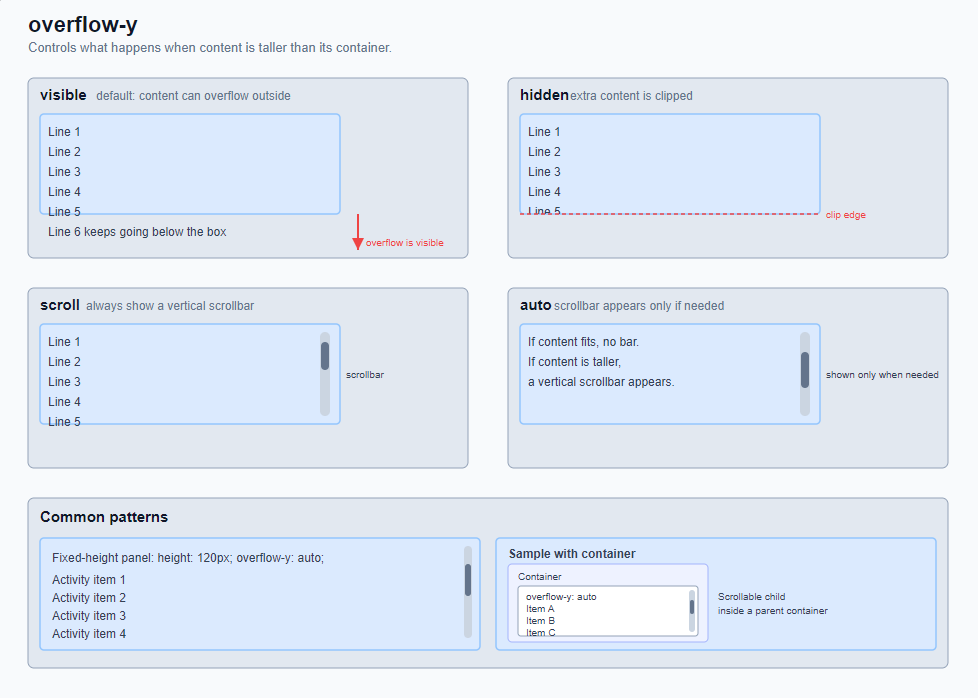
OverflowY:
Controls what happens if the content is higher in the vertical direction than its container.