Curve Creator
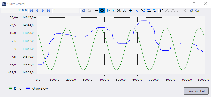
The Curve Creator can be used to display and manipulate data, from different sources, in one chart, on a common index axis. In addition to the chart, the Curve Creator also provides a legend that displays the names and colors of the graphs, as well as buttons that are used to save the graphs as an Analytics file.
Open tool from a YT chart
It is possible to load the currently displayed graphs of a YT Chart into the Curve Creator. For this, the recording of the scope view must be stopped.

When you click on the highlighted icon of the toolbar in the YT Chart, a new Curve Creator window will open. In the Curve Creator, the displayed data of the channels of the YT chart are then displayed.
The values of the graphs can then be saved using the Save and Exit button. When saving, you can specify whether only the visible or also the invisible graphs are to be saved. You can also specify whether the data should be saved in the same folder as the Scope project or in a freely selectable folder. After closing the window, the graphs are stored as a sequence in the data pool.
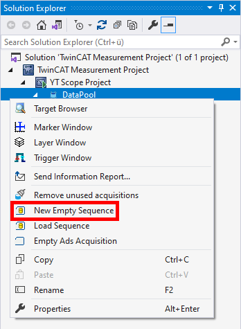
Create new sequences
There is a possibility to create new sequences with freely adjustable data. For this purpose, New Empty Sequence must be selected in the context menu of the data pool.
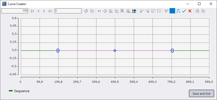
Then a new Curve Creator window will open. In the window there is a graph containing 1000 zero values. These can then be extended, shortened and edited.
When closing via the button Save and Exit, you are first asked whether only the visible or also the invisible graphs should be saved. You are then asked whether the data should be saved as an Analytics File, next to the project or in a folder of your choice. After saving, a new sequence with the saved data is added to the data pool
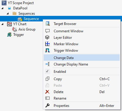
Editing in the data pool
Sequences can be viewed and edited using the Curve Creator. To do this, one or more sequences must be selected in Solution Explorer. Then the context menu can be opened and with Edit a Curve Creator window can be opened.
When you click the Save and Exit button, the data is written to its original sequence.
Analytics Workbench file path parameters
In Analytics Workbench there are several functions with file path parameters. Here the Curve Creator can be used to create or view Analytics files.

When the button in the File Path parameter is clicked for editing, a Curve Creator window opens. If the specified file does not exist, then a new graph is created, otherwise the first symbol of the Analytics file is displayed.
When saving, either a new folder where the data will be saved can be selected or if the file already existed, then the Override and Exit button can be used to replace the opened file. When a new file has been saved, the file path in the parameter is updated.
Track Editor
In Analytics Data Scout, the Curve Creator can be used in the Track Editor to modify track data. When opened, the range that is also displayed in the chart is loaded from the track data and displayed in the Curve Creator.
When closing via the button Save and Exit, you are first asked whether only the visible or also the invisible graphs should be saved. The graphs are then saved in an Analytics File and the changed area in the tracks is replaced with the new Analytics File. If the functions have been used to change the start or end point of graphs, it is not the selected range that is replaced, but the range from which the data originate. After closing the Curve Creator, the number of samples remains the same.
Operation
In Curve Creator, there are several functions in the toolbar for editing and displaying graphs.
Navigation

Similar to a YT chart, the displayed area can be changed in the Curve Creator. However, no time is displayed on the X-axis, but indices. Therefore, the display width text field and the position text field contain index values and no times.
Since there is no adjustable default display width, Zoom to default only returns the Y-axis and not the X-axis to the default value.
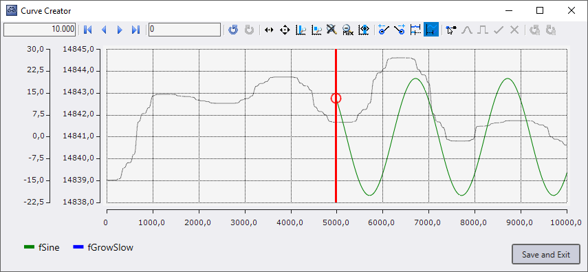
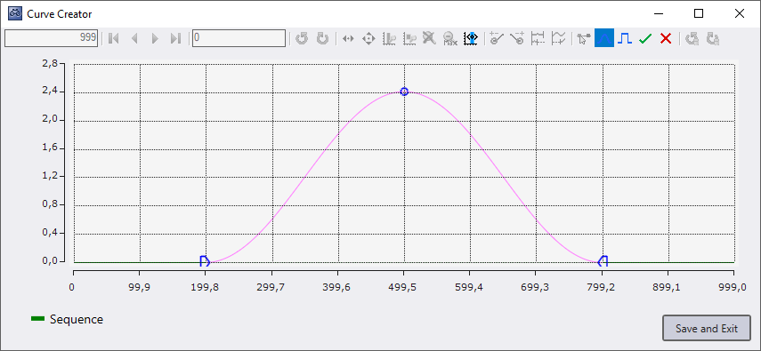
Change start and end point

It is possible to lengthen or shorten the graphs using these mouse modes, at the start or at the end. If one of the modes is selected, all graphs are selected. This can be recognized by the fact that all graph names are underlined in the legend. The graph can be selected or deselected by clicking on a graph name. If a graph is no longer selected, it is displayed in a slightly grayish color and is no longer underlined in the legend. You can also click on a graph in the chart to select it. After clicking on the graph, only this graph is selected. If the [Ctrl] key is pressed during the click, a multiple selection of the graphs can be edited. In addition, you can press a free area of the chart and draw a rectangle by holding down the left mouse button. When you release the mouse button, all the graphs that were inside the rectangle at the time of your release will be selected.
All selected graphs have a round shape at the start or end; the unselected graphs are grayed out.
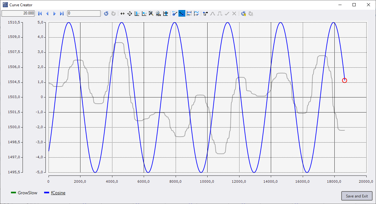
The round red shape that now appears can be clicked. When clicked, a marker is displayed. This can be moved by moving the mouse.
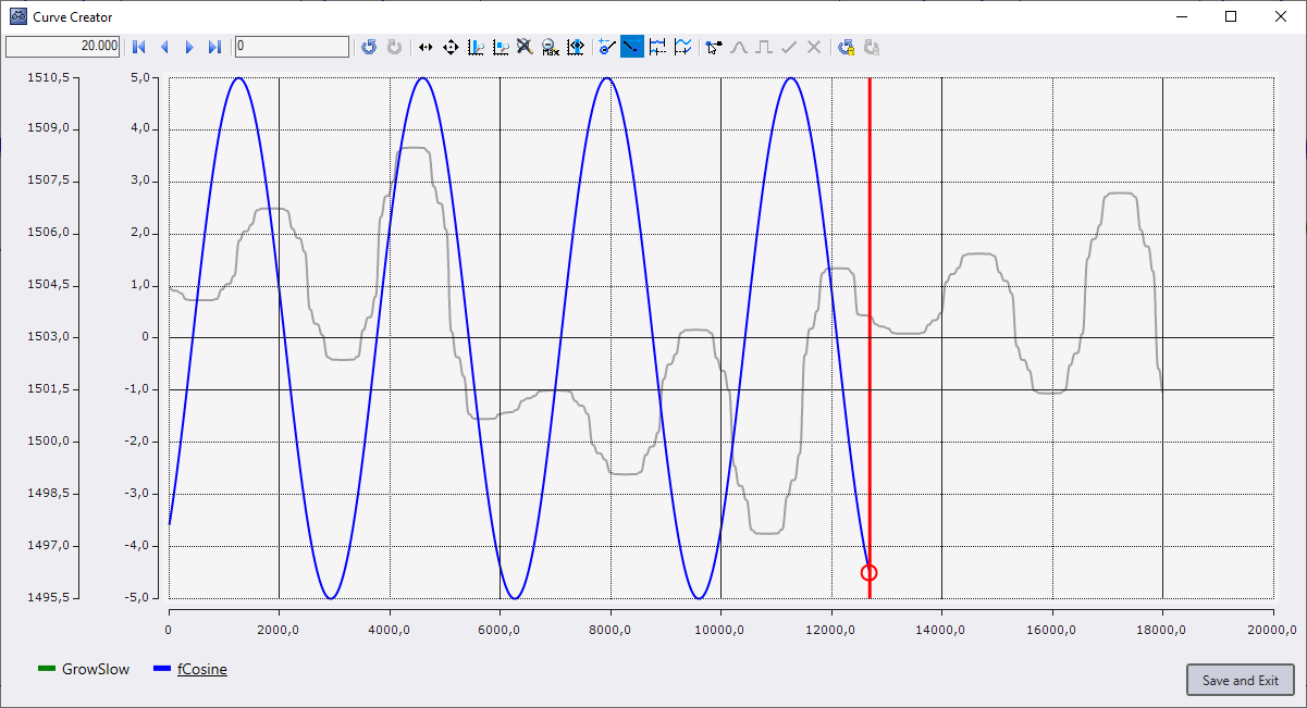
When the left mouse button is released, the selected graphs are lengthened or shortened to the position of the marker. This happens even if the marker has not been moved for some time, but the action is not completed until the mouse button is released.
If several graphs are selected and do not start or end at the same point, the distance between the graphs is maintained when they are lengthened or shortened.
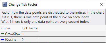
Compress and stretch

This functionality allows you to change the distances between the values of a graph on the X-axis. The values of the graphs are not changed, only the index distance between the values. To use this function, the window shown below is opened, in which the factor of the distance between the values on the X-axis can be set. If one data point is to be displayed on each index of the X-axis, the factor must be set to '1'. If only one data point is to be on every second index, select the factor '2'.
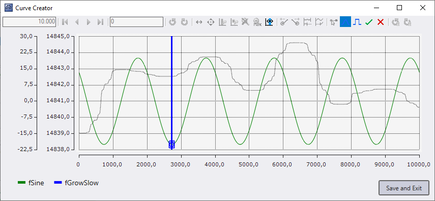
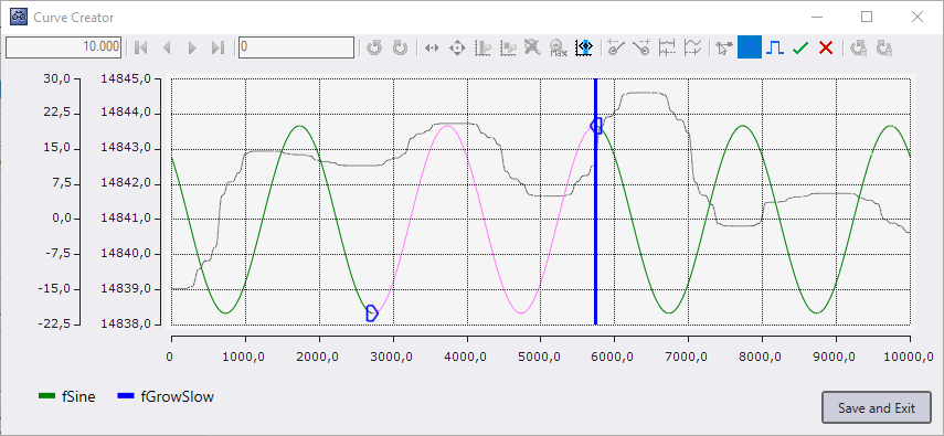
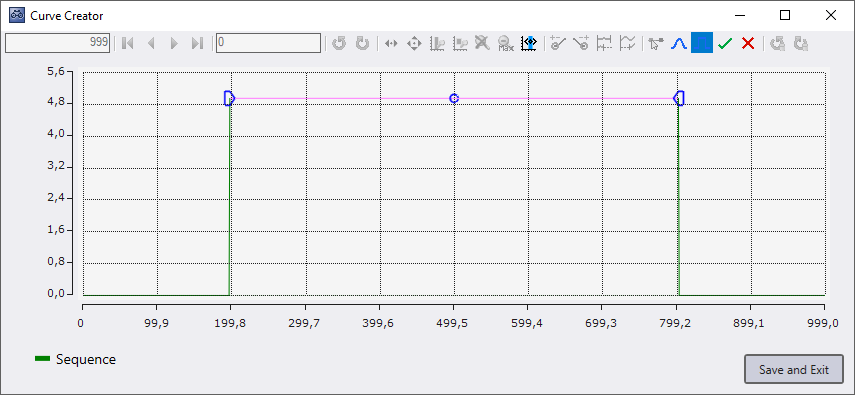
Set start offset

This mouse mode can be used to set the start position of graphs on the X-axis. To set the start offset, graphs must be selected by clicking on them. Selected graphs get a red round shape at the start, unselected graphs are grayed out.
When a shape is clicked with the left mouse button, a marker appears. This marker indicates where the start position of the graphs should be. As long as the mouse button is pressed, the marker can be moved by moving the mouse. When you release the mouse button, the marker disappears and the start offset of the graphs is adjusted.
Selection mode

The Curve Creator can be used to manipulate the values of graphs. To manipulate values, an area in a graph must first be selected. The selection mode can be activated for this purpose. Then a graph can be clicked to start a selection.
A marker and two blue shapes are displayed at the value clicked on in the graph. As long as the mouse button remains pressed, the marker can be moved by moving the mouse. When moving the marker, an area between the start point and the marker is selected. The selected area has a different color than the unselected area and has a blue shape at the start and at the end. When the mouse button is released, the marker disappears.
With the help of the blue shapes the selected area can be changed afterwards. To do this, just click on one of the shapes and a marker will appear that can be moved as in the initial selection.
There can be only one selected area in the Curve Creator. Once an area has been selected, only the buttons for editing the selected area are operable.

To cancel the selection, the editing can be ended by clicking on the checkmark in the toolbar or canceled by clicking on the X in the toolbar. When canceling, the graph is reset to the state before the selection. When clicking in the empty area in the chart, the selection, as when clicking on the checkmark, is canceled and the changes to the graph are applied.
Transformations
The transformation mouse modes are only available if an area has been selected with the selection mode. The transformations can be used to edit a selected area. To do this, click with the left mouse button on the selected graph, then a round blue shape will appear at the place where the center of the transformation is. By moving the mouse while the mouse button is pressed, the center of the transformation can be moved up or down. When the mouse button is released, the round blue shape disappears and the transformation is complete. Several transformations can be applied before the selection mode is terminated.
Curves transformation

The Curves transformation puts a curved offset on the graph. The change is greatest at the center and becomes smaller the closer the value is to the start or end of the selection.
Y offset transformation

The offset transformation gives each value in the selected range the same offset based on how far the mouse has moved up or down from the start of the transformation.
Undoing actions

In the Curve Creator it is possible to undo certain actions. This includes lengthening, shortening, compressing, stretching, setting start offset and transforming graphs. To undo these actions you can use the Undo Redo buttons on the right side. The Undo Redo buttons in the navigation area only undo the change of the displayed area.
Legend
A legend is displayed below the chart, listing all Curve Creator graphs by name and color.
Hide graphs
It is possible to hide the graphs in the Curve Creator. Hidden graphs will be grayed out in the legend. To hide a graph, either click on the colored rectangle in the legend or right-click on a graph in the context menu. Hidden graphs are saved as well. You can click again on the colored area in the legend to unhide. If the Curve Creator has been opened from a YT chart, graphs can be deleted via the legend or the context menu. Deleted graphs are not saved.
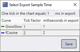
Export with Sample Time setting
If the Sample Time can be set for the exported data, the window shown below will open before the export. The Base Sample Time with which the graphs are to be exported can be defined in the upper area of the window.
The table lists the various graphs with their factor ("compression and stretching") and their associated Sample Time. The Sample Time is calculated by multiplying the Base Sample Time by the factor, as the Base Sample Time indicates the duration of an index on the X-axis.