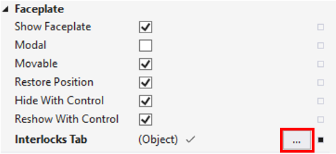
Category: Faceplate
The following table shows the faceplate category properties
Property | Description |
|---|---|
Show Faceplate | Enable/disable faceplate (1 – enable; 0 – disable). |
Modal | Defines whether the popup overlay is modal. A modal popup darkens the background and is not moveable. Clicking on the darkened background closes the modal pop-up. |
Movable | Defines whether the pop-up overlay is movable. |
Restore Position | Defines whether the last bounds after moving/resizing the pop-up will be restored when opened the next time. |
Hide With Control | Hide faceplate automatically if the control is hidden (i.e., when switching on another view). Preload or at least KeepAlive *.content page properties have to be set to TRUE in order for the faceplate not to be hidden if Hide With Control is FALSE. |
Reshow With Control | Shows faceplate automatically if the control is shown again and the faceplate was shown before hiding the control. Preload or at least KeepAlive *.content page properties have to be set to TRUE so that the Faceplate will appear again if Reshow With Control is TRUE. |
Interlocks Tab | Path to an Interlock UserControl to present Interlocks tab of the faceplate (if empty, the Interlocks tab isn't shown). This property is only appropriate for predefined faceplates. More detailed information is given in the Category: Faceplate paragraph. |
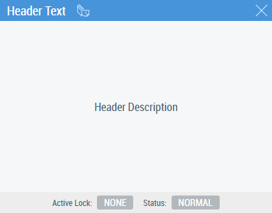
Header Text | Content of the header textbox in the faceplate. |
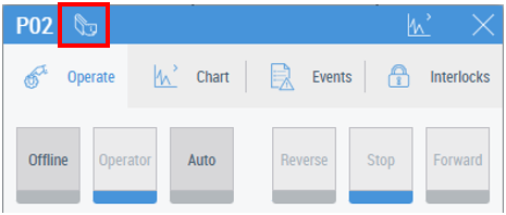
Show Header Description | Enable/disable to show Header Description button on the control Faceplate:
The button switches on and off presenting Header Description. |
Header Description | Contains a description of the control. If switched on by the dedicated button, it is shown on the faceplate instead of other Tabs:
|
Show Reset Button | If active, the Reset button is shown on the message footer independent of the emergency state of the control. |
Faceplate Left | Faceplate is initially positioned on the left (default position is the control left position). |
Faceplate Top | Faceplate initially positioned at top (default position is the control top position). |
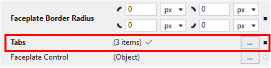
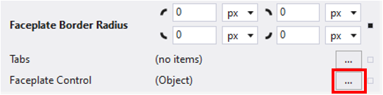
Faceplate Border Radius | Radius of the faceplate border. |
Tabs | A list of tabs to be displayed in the faceplate. More detailed information is given in the Tabs property paragraph. |
Faceplate Control | Path to a custom faceplate instead of the one taken from the Data Symbol property. Overwrites all faceplate content which also means that the Tabs will not be shown. More detailed information is given in the Faceplate Control property paragraph. |
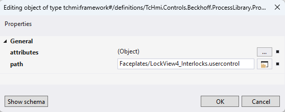
Interlocks Tab property
Use the “…” button in the Control properties to open the window for Interlocks tab configuration.
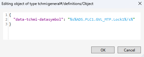
Two properties should be configured in the configuration window: attributes and path:
The attributes property should contain a SymbolExpression with a PLC variable which is an instance of LockView FBs from Tc3_MTP library: FB_MTP_LockView4, FB_MTP_LockView8, FB_MTP_LockView16 (depending on the quantity of required interlock reasons). The sample of such a record for the PLC variable PLC1.GVL_MTP.Lock1 (Lock1:FB_MTP_LockView4) is shown below:
The path property should contain the LockView UserControl with the corresponding number of inputs:
- Faceplates/LockView4_Interlocks.usercontrol
- Faceplates/LockView8_Interlocks.usercontrol
- Faceplates/LockView16_Interlocks.usercontrol
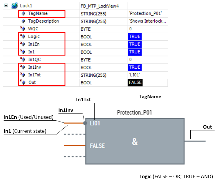
Properties and current states of the interlock control should be specified in the LockView FB instances of a PLC program. A sample of correspondence between the FB data and the control states is shown below (the involved variables of the FB are outlined in red):
Tabs property
Tabs configuration window is available via “…” button.
After pushing the “…” button, the faceplate settings window opens:
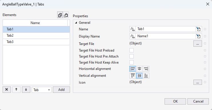
The following table shows the description of the faceplate setting window elements tab:
Elements | Description |
|---|---|
| Delete the selected tab |
| Change the tab order (higher, lower) |
| Type of object (only tab) |
| Add a new tab |
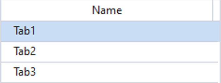
| List of current tabs. Tab1 is active (its properties are available for editing). |
| Copy/paste current tabs. |
| Internal tab name |
| Tab name displayed on HMI |
| Choose *.usercontrol or *.content element as a content for the tab |
| Enable preload for the tab content *) |
| Enable pre-attach for the tab content *) |
| Enable keep alive for the tab content *) |
| Horizontal alignment for the displayed tab name |
| Vertical alignment for the displayed tab name |
| Icon for the tab |


*) – See the “Control life cycle” paragraph in the TE2000 TwinCAT 3 HMI manual for detailed information
Examples of how to configure the Tabs property for:
Faceplate Control property
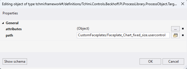
Use the “…” button in the Control properties to open the window for Faceplate Control property configuration.
In the configuration window:
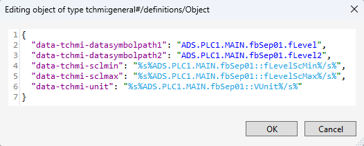
- property attributes contains a JS object with faceplate UserControl parameters
- property path refers to the UserControl which is intended to be used for the faceplate
Names of the faceplate parameters which are required for the attributes property can be taken from the *.usercontrol.json file of the faceplate (View Code in context menu should be used to open the file in a text mode).
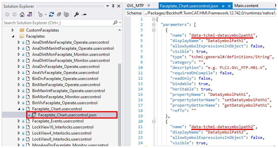
An example of how to configure the attributes property of Faceplate Control property to utilize Faceplate_Chart.usercontrol for the customized faceplate is shown below: