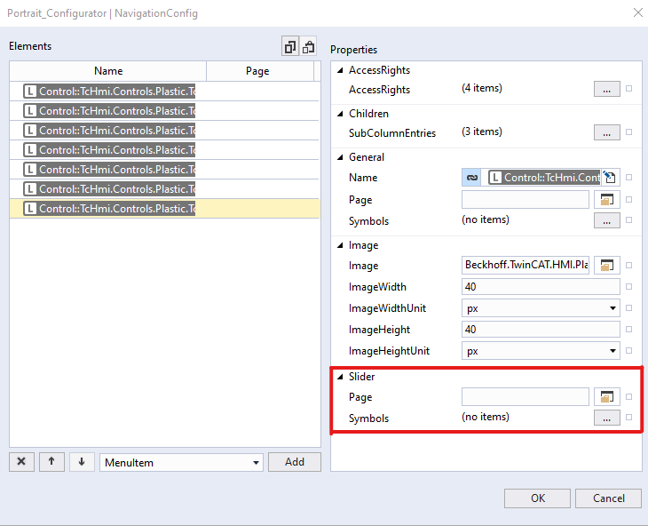
NavigationConfig
In Tc3_PlasticAppHmi projects a TcHmiNavigationbar control from package Beckhoff.TwinCAT.HMI.ResponsiveNavigation is used to configure and allow users to navigate to different contents.
Every content displayed on the main region can have related settings content displayed in the slider region in this application.
This attribute allows a user to configure the complete navigation tree and add information regarding any settings content needs to be displayed in the slider region when the target content is shown on the main region of the application. The configurator control watches any changes of content on the main region, and if configuration requires loads the slider content in the slider region.
More details on Navigation Bar Control and its MenuSrcData is available at this link.

For every content that is configured with this attribute, two new properties are available in comparison to the MenuSrcData attribute of the Navigation Bar control.
- Slider Content: This is the path of content that should be displayed in the slider region when the Page is displayed in the main region.
- Slider Symbols: If the content displayed in slider area is ‘Parameters_Settings.content’, the symbols property can be used to configure which parameters will be displayed on the content. A user can link a symbol of type ‘fbParamHandle’ to this property.
Schema: tchmi:framework#/definitions/PlasticNavigation
Attribute getter: getNavigationConfig
Attribute setter: setNavigationConfig
Available: since version 12.8.0