Step by step
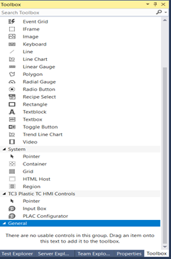
- 1. Drag and drop the InputBox from the Toolbox window onto the content or view file.
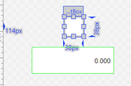
- 2. If the control DataType attribute is set to
BoolDataType, its width and height must be equal for proper display.
- 3. Set the DataType attribute of the type
FBValue_DataType, it will set how the control looks and functions.
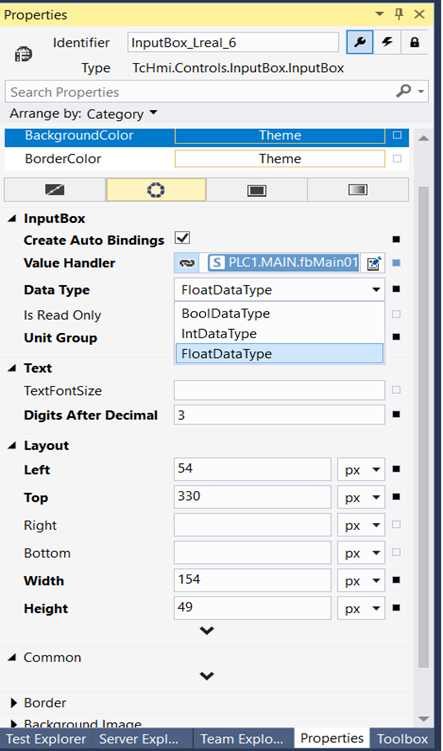
If the Data Type is BoolDataType the control will form a Checkbox, with a checkmark matching the boolean state of the related TextVal attribute. 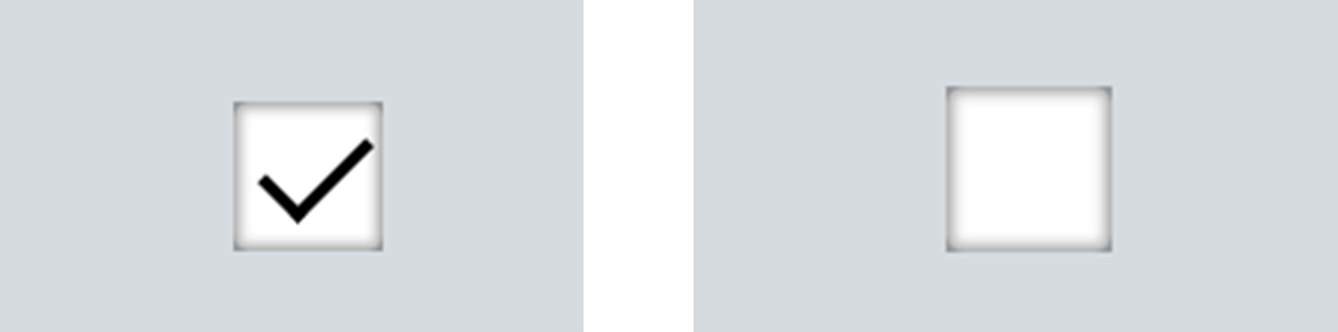
For IntDataType, FloatDataType or TimeDataType the control will show as a textbox, with numbers from its TextVal attribute displayed in decimal format.
The InputPanel will appear when the user clicks/taps on the control.
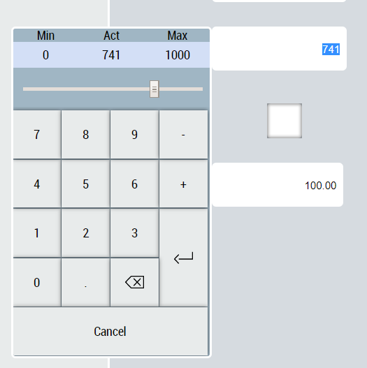
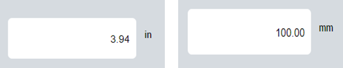
If data type is set as either FloatDataType or TimeDataType, numbers will be displayed in the display unit of the given data type.
The unit text is displayed next to the control if the DisplayUnitText attribute is set to TRUE.
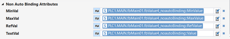
- 4. The attributes TextVal, RefVal, MinVal and MaxVal can be mapped to any number or boolean symbol in the project.