Image list
The attributes and functions explained on this page can be found in the List category.
Property: ImageListVisible
The ImageListVisible property can be used to hide and show the image list. If the list is hidden, the toolbar takes up the entire area of the control. As the control is initialized in portrait format, the height should be adjusted for this case.
Image list
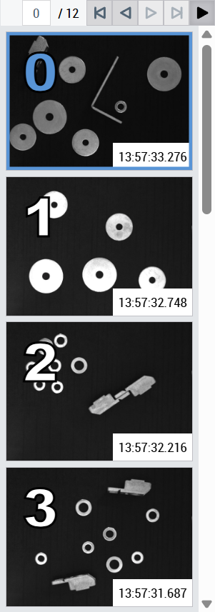
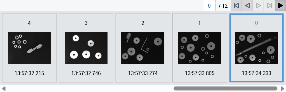
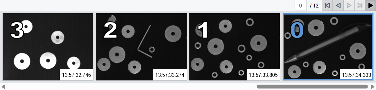
The image list shows an entry for all temporarily saved history images if ImageFreeze of the linked ImageWatch control is activated. The index number, the corresponding image, and the timestamp are displayed in the list for each image. The timestamp is from the time at which the corresponding image was received by the ImageWatch control. As a prerequisite, the QueueSize of the ImageWatch control must be greater than 0.
In the following cases, an alternative text is displayed instead of the image list:
- If no ImageWatch control is linked: "Link an ImageWatch control to use the image history"
- If ImageFreeze is not active: "Activate freeze to show the image history"
- If the history queue is empty: "The image history queue is empty"
Depending on the orientation, the top or right-hand list entry always represents the currently received image. An image can be chosen by clicking on an entry. The image selected in the list is highlighted and displayed in the linked ImageWatch control.
Property: Orientation
The Orientation property is used to define how the entries are arranged in the image list. vertikal means from top to bottom, and horizontal means from right to left. This means that the last image added with index 0 is always at the top or right-hand side of the image list.
Visibilities
The contents of the list entries can be shown and hidden as required. The attributes IndexVisible, ImageVisible and TimestampVisible are used for this purpose. The contents always appear in the following order: index, image, timestamp. If the list is oriented vertically, the content is arranged from left to right and if it is oriented horizontally, from top to bottom.
Property: FitImage
If the property FitImage is activated, the images in the list are displayed maximized. The index moves to the upper left corner of the image and the timestamp to the lower right corner. To ensure that both remain clearly visible, the index has a larger font and a text border. The timestamp, on the other hand, has a single-color background.
This standard configuration can be customized using the properties IndexColor, IndexStrokeColor, IndexBackgroundColor, TimestampColor, TimestampStrokeColor and TimestampBackgroundColor in the Colors category. For example, the index can also be given a single-color background and the timestamp a text border. Alternatively, the monochrome background of the timestamp and the text border of the index can be removed by setting a transparent color.
Property: ImageSize
The desired image size of the images in the list can be specified using the ImageSize property. For vertical orientation, this property refers to the image height. In the case of horizontal orientation, accordingly to the image width. If the image would take up the space of other content with the set image size, it is automatically reduced in size. If this is not desired, the size of the entire control should be extended in width (vertical) or height (horizontal), depending on the orientation.
Performance
When ImageFreeze of the ImageWatch control is activated for the first time, the image list of the History control is created. For larger QueueSize values and depending on the system performance, this may require more time. Each time ImageFreeze is activated, only the list entries are updated, provided the number of entries remains the same, which is much faster. We therefore recommend that you do not select QueueSize too large.
Properties for customizing the font
The ListFontFamily, ListFontSize, ListFontStyle and ListFontWeight properties are available to customize the list stylistically.