Image view
The attributes and functions explained on this page can be found in the View category.
Internally, the size and position of the displayed image is precisely defined by the Offset, Scale and ScaleReference properties. However, the typical use case for changing size and position is using interactive features such as touch and mouse gestures. Thereby the above mentioned properties are automatically changed internally by those gestures.
Property: Offset
The Offset property specifies the image position relative to the control itself. The upper left corner is defined as the origin, with the X-axis to the right and the Y-axis down. The offset of the image is also measured from the upper left corner of the image. The offset coordinates are specified in pixels.
As mentioned earlier, the Offset property is changed by the control itself, for example, when the user interacts with the image using touch or mouse gestures.
By default, the offset property is associated with a TwoWay binding.
Properties: Scale and ScaleReference
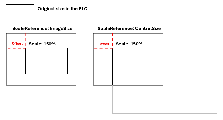
The Scale property specifies a scaling factor in percent to calculate the pixel size in which the image is displayed on the screen. The size is always calculated in relation to the original image size or in relation to the size of the control, depending on the value of the ScaleReference attribute.
The ScaleReference can be one of the following values:
ImageSize | The size of the displayed image is equal to the original image size multiplied by the value of the Example: the original size of the image is 300x200, the |
ControlSizeWidth | The size of the displayed image is equal to the width of the control (or more precisely, the image frame within the control) multiplied by the value of the |
ControlSizeHeight | The size of the displayed image is equal to the height of the control (or more precisely, the image frame within the control) multiplied by the value of the |
ControlSize | The size of the displayed image is equal to the size of the control (or more precisely, the image frame within the control) multiplied by the value of the |
The advantage of the ImageSize setting is the direct relationship between the displayed size and the original size of the image. Two images with different sizes in the PLC always have different sizes in the HMI. The advantage of the ControlSize setting is the automatic adjustment of the image to the control. The images are always the same size, regardless of how large they actually are within the PLC.
 | Aspect ratio The height and width of the image are always calculated to maintain the aspect ratio of the original image. |
Example: Offset, Scale and ScaleReference
Property: FitImage
To automatically center the image and adjust it to the control size, the FitImage properties can be activated. Fit mode is then active so that all future or past (history) images are displayed scaled and positioned accordingly, even if the resolution is different. If Scale or Offset are changed in any other way during runtime, e.g. by dragging with the mouse, scrolling or by programmatic setting, FitImage is automatically set to false. Fit mode is then ended. This can also be done manually, and fit mode can be reactivated at any time by going to true.
Function: FitImageToControl (obsolete, use FitImage instead)
To maximize and center the currently displayed image within the Image Viewer, the FitImageToControl function can be called. If this is to be done from the beginning, the function should be linked to the .onAttached event. Once this function has been activated, all subsequent images will also be centered and maximized until the view is changed elsewhere, thereby canceling the mode.
Property: ScalingCenter
The ScalingCenter offers a possibility to adjust the scaling behavior. An individual change of the Scale properties always results in a change of the lower right corner of the image, while the upper left corner remains fixed. To change this and fix other points, the ScalingCenter property can be used. In this case, the Offset property is automatically adjusted. The following options are available:
ScaleCenter value | Description |
|---|---|
| Upper left corner of the image stays centered when zooming. |
| Center of the image remains centered when zooming. |
| Center of the control remains centered when zooming. |
Gestures
The user can change the size and position of the image by the following gestures/interactions:
- Hold the left mouse button anywhere in the image frame and drag the mouse to move the image and thus change the
Offsetproperty. TheScaleproperty remains unaffected. - Touch the image frame with one finger and move your finger to move the image to change the
Offsetproperty. TheScaleproperty remains unaffected. - Scroll with the mouse wheel to change the size of the image and thus the
Scaleproperty. The center of the scaling will always be the position of the mouse pointer. As a result, theOffsetproperty may also change accordingly. The mouse pointer must always be positioned over the control. - Touch the picture frame with two fingers and move both fingers in one direction, towards or away from each other, to change the position and size of the picture. Both the
OffsetandScaleproperties are adjusted.
To prevent these user interactions, both the Draggable and Scalable properties can be set to false to prevent a user-induced change of position or size. Changing the value (e.g. by writing to the symbol) is always possible and is not affected by the two properties.
Properties: ScaleMin and ScaleMax
The control positioning and scaling system applies limiting rules to prevent the user from creating confusing or disorienting views of the image.
The ScaleMin and ScaleMax properties represent limits on the setting of the Scale property for user interactions.
In addition, the control automatically restricts the image to its borders with a certain outer padding (currently 10px). Positions outside this limit are not useful as you cannot see the image.
Property: View (read-only)
The Offset and Scale properties are good for internal handling of the image view, but are not necessarily intuitive for the user (e.g. to define an image area). People often tend to think in terms of regions of interest or similar representations. Therefore, after changing the size or position of the image, the currently visible area of the image is calculated and provided via the read-only View property.
The internal calculation always sets the coordinate origin to the upper left corner of the image and calculates from there the upper left position as well as the width and height of the image frame.
The View property is provided as an array in the [X, Y, Breite, Höhe] form.
To set the position and size using a view description, see the next section on the SetView function.
Function: SetView
The SetView function allows the user to display a specific area of the image. When this function is called, the image area specified by a parameter is maximized and centered within the image frame.
The area must be specified in the original image coordinates as [x, y, Breite, Höhe].
| Differing views Depending on the aspect ratios of the specified area and the image frame, the requested view may differ from the actual view. This in turn can be retrieved via the read-only |
| Separate action The view functionality is not accessible via a property, but via a read-only property and a setter method. The reason for this is the difference between an ordered view and the actual view mentioned above, and also that a View property would conflict with the |
Stop image flow
If the ImageFreeze property is true, the currently displayed image does not change even if new images are received. The intended use case is to freeze the current image for further review without adding additional logic within the PLC.
If the ImageFreeze property is changed from true to false, the control immediately displays the last image again and ignores the intermediate images.
The ImageFreeze property can be controlled by the Freeze button in the toolbar (see FreezeButtonVisible property in the Toolbar category).