RGBW lighting
The described widget is suitable for operating RGBW illumination from the app. The various configuration options are described below. In the figure all available features of the widget are active.
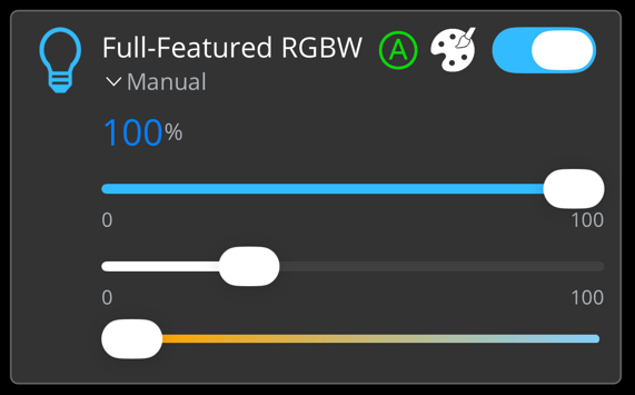
The following illustration shows the color palette that becomes visible by clicking on the color palette icon. If the same value is selected for 100 ms when moving the selection point, it is sent by the app to the PLC.

The widget is passed as a substructure in the overall structure of the SendData() method. To set-up the widget, various PLC attributes are used when declaring the structure.
{attribute 'iot.ReadOnly' := 'false'}
{attribute 'iot.DisplayName' := 'Name for Widget'}
{attribute 'iot.WidgetType' := 'RGBW'}
{attribute 'iot.LightValueVisible' := 'true'}
{attribute 'iot.LightSliderVisible' := 'true'}
{attribute 'iot.LightColorPaletteVisible' := 'true'}
{attribute 'iot.LightColorTemperatureSliderVisible' := 'true'}
{attribute 'iot.LightWhiteSliderVisible' := 'true'}
{attribute 'iot.LightModeVisible' := 'true'}
{attribute 'iot.LightModeChangeable' := 'true'}
stGeneralWidgetSample : ST_RGBWWidgetSample;
Attribute | Data type | Description |
|---|---|---|
iot.ReadOnly | BOOL | Determines whether the widget on the app side gets only read access (TRUE) or also additional write access to the PLC (FALSE). |
iot.DisplayName | STRING | The display name of the widget in the app. This will be overwritten by sDisplayName as soon as sDisplayName is not an empty string. |
iot.WidgetType | STRING | Type specification for the widget, in this case: RGBW. |
iot.LightValueVisible | BOOL | Determines whether the dimming value is displayed (TRUE) or not (FALSE). |
iot.LightSliderVisible | BOOL | Determines whether the upper of the three sliders (for the dimming value of the light) is visible (TRUE) or not (FALSE). |
ioT.LightColorPaletteVisible | BOOL | Determines whether the color palette is displayed (TRUE) or not (FALSE). |
ioT.LightColorTemperatureSliderVisible | BOOL | Determines whether the lower of the three sliders (for the color temperature) is visible (TRUE) or not (FALSE). |
ioT.LightWhiteSliderVisible | BOOL | Determines whether the middle of the three sliders (for the white component) is visible (TRUE) or not (FALSE). |
iot.LightModeVisible | BOOL | Determines whether the mode is displayed (TRUE) or not (FALSE). |
iot.LightModeChangeable | BOOL | Determines whether the mode is adjustable (TRUE) or not (FALSE). |
TYPE ST_RGBWWidgetSample :
STRUCT
    sDisplayName      : STRING := '';
    nError            : USINT;
    nState            : USINT;
    bLight            : BOOL := FALSE;
    {attribute 'iot.Unit' := '%'}
    {attribute 'iot.MinValue' := '0'}
    {attribute 'iot.MaxValue' := '100'}
    nLight            : INT := 100;
    nHueValue         : INT := 57;
    nSaturation       : INT := 100;
    {attribute 'iot.MinValue' := '2400'}
    {attribute 'iot.MaxValue' := '6500'}
    nColorTemperature : INT := 3500;
    nWhite            : INT := 50;
    sMode             : STRING := 'Automatic';
    aModes            : ARRAY[0..1] OF STRING := ['Manual', 'Automatic'];
END_STRUCT
END_TYPE
Attribute | Data type | Description | Display in widget |
|---|---|---|---|
sDisplayName | STRING | Determines the display name of the widget and overwrites the PLC attribute 'iot.DisplayName'. | Display text of the widget. |
nError | USINT | Specifies whether the widget is in an error state. | Between icon and display name of the widget. |
nState | USINT | Specifies which status icon is displayed in the widget. | Top right in the corner of the widget, to the left of the button and the color palette. |
bLight | BOOL | Switches the illumination on (TRUE) or off (FALSE). | Toggle switch top right. |
iot.Unit | STRING | Unit of the dimming value. | Unit after the numerical value. |
iot.MinValue | INT | Lower limit of the dimming value. | On the left side under the top slider. |
iot.MaxValue | INT | Upper limit of the dimming value. | On the right side under the top slider. |
nLight | INT | Dimming value of the illumination. | Numerical value and additional display in the fill area of the upper slider. |
nHueValue | INT | The Hue color value in the value range from 0 (red) to 360 (red again). | The position within the circle in the color palette. |
nSaturation | INT | Saturation of the color value in the value range from 0 (gray) to 100 (selected color). | The value 0 is at the center of the color wheel, and the value 100 is at the very edge of the color wheel. |
iot.MinValue | INT | Lower limit of the color temperature value. | No explicit display, defines the value range of the lower slider. |
iot.MaxValue | INT | Upper limit of the color temperature value. | No explicit display, defines the value range of the lower slider. |
nColorTemperature | INT | Value of the color temperature. | Display in the lower slider. |
nWhite | INT | Value of the white component (between 0 and 100). | Display in the middle slider. |
sMode | STRING | Mode of illumination. | The currently displayed mode. |
aModes | ARRAY [0..n] OF STRING | Array of the different modes that can be set by the user. | By pressing on the current mode, the adjustable modes can be displayed. |