Generic widget
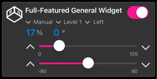
The described widget is suitable for displaying a custom widget in the app, which is a flexible alternative in addition to the specific widgets. The various configuration options are described below. In the figure all available features of the widget are active.
The widget is transferred as a substructure in the overall structure of the SendData() method. To build the widget, various PLC attributes are used when declaring the structure.
{attribute 'iot.ReadOnly' := 'false'}
{attribute 'iot.DisplayName' := 'Name for Widget'}
{attribute 'iot.WidgetType' := 'General'}
{attribute 'iot.GeneralWidgetIcon' := 'Room'}
{attribute 'iot.GeneralWidgetColor' := '#F81894'}
{attribute 'iot.GeneralValue1SwitchVisible' := 'true'}
{attribute 'iot.GeneralValue2Visible' := 'true'}
{attribute 'iot.GeneralValue2SliderVisible' := 'true'}
{attribute 'iot.GeneralValue2SliderValuesVisible' := 'true'}
{attribute 'iot.GeneralValue2SliderButtonsVisible' := 'true'}
{attribute 'iot.GeneralValue2SliderButtonsInverted' := 'true'}
{attribute 'iot.GeneralValue3Visible' := 'true'}
{attribute 'iot.GeneralValue3SliderVisible' := 'true'}
{attribute 'iot.GeneralValue3SliderValuesVisible' := 'true'}
{attribute 'iot.GeneralValue3SliderButtonsVisible' := 'true'}
{attribute 'iot.GeneralValue3SliderButtonsInverted' := 'true'}
{attribute 'iot.GeneralMode1Visible' := 'true'}
{attribute 'iot.GeneralMode1Changeable' := 'true'}
{attribute 'iot.GeneralMode2Visible' := 'true'}
{attribute 'iot.GeneralMode2Changeable' := 'true'}
{attribute 'iot.GeneralMode3Visible' := 'true'}
{attribute 'iot.GeneralMode3Changeable' := 'true'}
stGeneralWidgetSample : ST_GeneralWidgetSample;
Attribute | Data type | Description |
|---|---|---|
iot.ReadOnly | BOOL | Determines whether the widget on the app side gets only read access (TRUE) or also additional write access to the PLC (FALSE). |
iot.DisplayName | STRING | The display name of the widget in the app. This will be overwritten by sDisplayName as soon as sDisplayName is not an empty string. |
iot.WidgetType | STRING | Type specification for the widget, in this case: General. |
iot.GeneralWidgetIcon | STRING | Determines which icon is used for the widget. The list of available icons can be found at List of available icons. |
iot.GeneralWidgetColor | STRING | Determines with which color sliders and buttons are displayed. The list of available colors can be found at List of available colors. The color must either be specified in one of the strings given in the appendix or as a hex code with "#" in front of the value. |
iot.GeneralValue1SwitchVisible | BOOL | Determines whether the button is displayed (TRUE) or not (FALSE). |
iot.GeneralValue2Visible | BOOL | Determines whether the left of the two numerical values is visible (TRUE) or not (FALSE). |
iot.GeneralValue2SliderVisible | BOOL | Determines whether the upper of the two sliders is visible (TRUE) or not (FALSE). |
iot.GeneralValue2SliderValuesVisible | BOOL | Determines whether the borders of the upper slider are visible (TRUE) or not (FALSE). |
iot.GeneralValue2SliderButtonsVisible | BOOL | Determines whether the buttons of the upper slider are visible (TRUE) or not (FALSE). |
iot.GeneralValue2SliderButtonsInverted | BOOL | This setting can be used to reverse the orientation of the top slider buttons. |
iot.GeneralValue3Visible | BOOL | Determines whether the right of the two numerical values is visible (TRUE) or not (FALSE). |
iot.GeneralValue3SliderVisible | BOOL | Determines whether the lower of the two sliders is visible (TRUE) or not (FALSE). |
iot.GeneralValue3SliderValuesVisible | BOOL | Determines whether the borders of the lower slider are visible (TRUE) or not (FALSE). |
iot.GeneralValue3SliderButtonsVisible | BOOL | Determines whether the buttons of the lower slider are visible (TRUE) or not (FALSE). |
iot.GeneralValue3SliderButtonsInverted | BOOL | This setting can be used to reverse the orientation of the buttons of the lower slider. |
iot.GeneralMode1Visible | BOOL | Determines whether the first mode is displayed (TRUE) or not (FALSE). |
iot.GeneralMode1Changeable | BOOL | Determines whether the first mode is adjustable (TRUE) or not (FALSE). |
iot.GeneralMode2Visible | BOOL | Determines whether the second mode is displayed (TRUE) or not (FALSE). |
iot.GeneralMode2Changeable | BOOL | Determines whether the second mode is adjustable (TRUE) or not (FALSE). |
iot.GeneralMode3Visible | BOOL | Determines whether the third mode is displayed (TRUE) or not (FALSE). |
iot.GeneralMode3Changeable | BOOL | Determines whether the third mode is adjustable (TRUE) or not (FALSE). |
TYPE ST_GeneralWidgetSample :
STRUCT
    sDisplayName    : STRING := '';
    bValue1         : BOOL := FALSE;
    {attribute 'iot.Unit' := '%'}
    {attribute 'iot.MinValue' := '0'}
    {attribute 'iot.MaxValue' := '100'}
    nValue2         : INT;
    nValue2Request  : INT;
    bValue2Up       : BOOL;
    bValue2Down     : BOOL;
    {attribute 'iot.Unit' := '%'}
    {attribute 'iot.MinValue' := '0'}
    {attribute 'iot.MaxValue' := '100'}
    nValue3         : INT;
    nValue3Request  : INT;
    bValue3Up       : BOOL;
    bValue3Down     : BOOL;
    sMode1          : STRING := 'Automatic';
    aModes1         : ARRAY[0..1] OF STRING := ['Manual', 'Automatic'];
    sMode2          : STRING := 'Automatic';
    aModes2         : ARRAY[0..2] OF STRING := ['Manual', 'Automatic', 'Next Mode'];
    sMode3          : STRING := 'Automatic';
    aModes3         : ARRAY[0..1] OF STRING := ['Manual', 'Automatic'];
END_STRUCT
END_TYPE
Attribute | Data type | Description | Display in widget |
|---|---|---|---|
sDisplayName | STRING | Determines the display name of the widget and overwrites the PLC attribute 'iot.DisplayName'. | Display text of the widget. |
bValue1 | BOOL | Turns the widget on (TRUE) or off (FALSE). | Toggle switch top right. |
iot.Unit | STRING | Unit of the first value. | Unit after the first numerical value. |
iot.MinValue | INT | Lower limit of the first value. | On the left side under the top slider. |
iot.MaxValue | INT | Upper limit of the first value. | On the right side under the top slider. |
nValue2 | INT | First value. | Display in the left numerical value and additionally in the filling of the upper slider. |
nValue2Request | INT | Request value for the first value. | The value to which the upper slider is moved. |
nValue2Up | BOOL | One of the buttons for the top slider. | On the left side of the upper slider. |
nValue2Down | BOOL | One of the buttons for the top slider. | On the right side of the top slider. |
iot.Unit | STRING | Unit of the second value. | Unit after the second numerical value. |
iot.MinValue | INT | Lower limit of the second value. | On the left side under the bottom slider. |
iot.MaxValue | INT | Upper limit of the second value. | On the right side under the bottom slider. |
nValue3 | INT | Second value. | Display in the right numerical value and additionally in the filling of the lower slider. |
nValue3Request | INT | Request value for the second value. | The value to which the lower slider is moved. |
nValue3Up | BOOL | One of the buttons for the bottom slider. | On the left side of the bottom slider. |
nValue3Down | BOOL | One of the buttons for the bottom slider. | On the right side of the bottom slider. |
sMode1 | STRING | First mode. | The currently displayed first mode. |
aModes1 | ARRAY [0..n] OF STRING | Array of the different modes that can be set by the user for the first mode. | By pressing on the current mode, the adjustable modes can be displayed. |
sMode2 | STRING | Second mode. | The currently displayed second mode. |
aModes2 | ARRAY [0..n] OF STRING | Array of the different modes that can be set by the user for the second mode. | By pressing on the current mode, the adjustable modes can be displayed. |
sMode3 | STRING | Third mode. | The currently displayed third mode. |
aModes3 | ARRAY [0..n] OF STRING | Array of the different modes that can be set by the user for the third mode. | By pressing on the current mode, the adjustable modes can be displayed. |