Cards
The various dialogs in the main section of Motion UI are referred to as cards. In the standard layout, this allows you to set axis enable flags and perform simple motion sequences. In addition, information on the current dynamic values, for example, is listed.
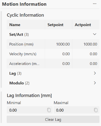
Moving and resizing the cards
You can change the position of the cards on the page using drag and drop. To do this, click on the card's header/title bar and, while holding down the mouse button, select a new position.
You can also change the size of each card by dragging and dropping the bottom-right corner of the card.
Customizing card content
You can name and fill the cards however you like, and you can manually adjust the order of the content. To switch to edit mode for the cards, use the three dots in the upper-right corner to open the card menu  and select
  . The individual sections of the card can now be rearranged using the displayed arrows
  . In addition, individual sections can be easily removed from the card using the trash can icon
  .
.
You can also edit the card name by clicking the pencil icon  , which appears next to the card name in edit mode. To exit edit mode, click Exit Edit Mode at the top of the card.
Add more cards
You can add more cards to the Motion UI via  . Using the drop-down menu, the user can choose between a predefined standard card type or a blank card, which they can then fill with content themselves.
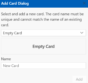
Under “Name”, the user can give the card a title.