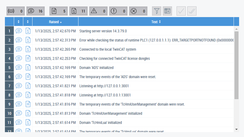
Event Grid
The Event Grid is provided for the tabular display of alarms and messages.
Attributes
Category: Colors
Name |
Description |
---|---|
Definition of the background color | |
Definition of the border color of the control |
Category: Layout
Name |
Description |
---|---|
Definition of the distance from the left side to the left side of the surrounding control | |
Definition of the unit of the distance to the right side of the surrounding control:
| |
Definition of the distance from the top side to the top side of the surrounding control | |
Selection of the unit of the distance to the top side of the surrounding control:
| |
Definition of the distance from the right side to the right side of the surrounding control | |
Selection of the unit of the distance to the right side of the surrounding control:
| |
Definition of the distance from the bottom side to the bottom side of the surrounding control | |
Selection of the unit of the distance to the bottom side of the surrounding control:
| |
Definition of the external width of the control | |
Selection of the unit of the width:
| |
Definition of the external height of the control | |
Selection of the unit of the height:
| |
Definition of the maximum width if the control size is defined as dynamic. | |
Selection of the unit of the maximum width:
| |
Definition of the minimum width if the control size is defined as dynamic. | |
Selection of the unit of the minimum width:
| |
Definition of the maximum height if the control size is defined as dynamic. | |
Selection of the unit of the maximum height:
| |
Definition of the minimum height if the control size is defined as dynamic. | |
Selection of the unit of the minimum height:
| |
Calculated distance in pixels from the left side to the left side of the surrounding control | |
Calculated distance in pixels from the top side to the top side of the surrounding control | |
Calculated distance in pixels from the right side to the right side of the surrounding control | |
Calculated distance in pixels from the bottom side to the bottom side of the surrounding control | |
Calculated width of the control in pixels | |
Calculated height of the control in pixels | |
Definition of the row of a grid in which the control is to be displayed. | |
Definition of the column of a grid in which the control is to be displayed. | |
Definition of the transparency of the entire control | |
Selection of the visibility of a control:
| |
Definition of the position on the Z-axis | |
Definition of a transformation of a control:
| |
Definition of a shadow | |
Selection of the method of calculating the width:
| |
Selection of the method of calculating the height:
|
Category: Common
Name |
Description |
---|---|
Defines which events are queried by the server | |
Defines sorting rules for sorting the displayed data. | |
The columns to be displayed in the EventGrid | |
Defines whether a dialog with detailed information is automatically displayed when interacting with an event entry. Activated by default. Can be disabled to implement a customized display of the detailed information. | |
Returns the selected event or zero if no event is selected. | |
Selection of whether a control should be activated | |
Definition of the name of the control | |
Type name of the control | |
Definition of control classes | |
If a control is logically assigned in the DOM. | |
Definition of the tooltip for the control |
Category: Border
Name |
Description |
---|---|
Definition of the radius of the four corners to round them off | |
Selection of the border style of the four sides of the control | |
Definition of the border width of the four sides of the control |
Category: Background Image
Name |
Description |
---|---|
Definition of an image that is located above the background color | |
Definition of the height of the background image | |
Selection of the unit of the height of the background image:
| |
Definition of the width of the background image | |
Selection of the unit of the width of the background image:
| |
Definition of an additional distance between the border of the control and background image for the four sides | |
Definition of the vertical alignment of the background image within the control | |
Definition of the horizontal alignment of the background image within the control |
Category: Menu Bar
Name |
Description |
---|---|
Defines the position of the menu bar. | |
Defines whether the menu bar is displayed. | |
Defines the font of the button text. | |
Defines the font size of the button text. | |
Defines the unit of the button text font size. | |
Defines the font style of the button text. | |
Defines the font weight (normal, bold) of the button text. | |
Defines the height of the buttons. | |
Defines the unit of button height. |
Category: Grid
Name |
Description |
---|---|
Defines the font of the text in the header bar. | |
Defines the font size of the text in the header bar. | |
Defines the font size unit of the text in the header bar. | |
Defines the font style of the text in the header bar. | |
Defines the font weight (normal, bold) of the text in the header bar. | |
Defines the font of the text in the table. | |
Defines the font size of the text in the table. | |
Defines the font size unit of the text in the table. | |
Defines the font style of the text in the table. | |
Defines the font weight (normal, bold) of the text in the table. | |
Defines the height of the header bar. | |
Defines the height unit of the header bar. | |
Defines the height of the table rows. | |
Defines the height unit of the table rows. |
Events
Category: Framework
Name |
Description |
---|---|
The control was added to the display. | |
The control was removed from the display. | |
The control was initialized. | |
The control was destroyed. | |
The control was moved in relation to the browser window. | |
The size of the control was changed. |
Category: Operator
Name |
Description |
---|---|
A mouse click was executed or a touch screen was briefly touched. | |
The left mouse button was clicked over the control and released. | |
The left mouse button was clicked twice over the control and released. | |
The right mouse button was clicked over the control and released. | |
A mouse button was pressed down over the control. | |
The mouse pointer was moved over the control. | |
The mouse pointer has left the control. | |
A mouse button was released over the control. | |
The left mouse button was pressed down over the control. | |
The right mouse button was pressed down over the control. | |
The mouse was moved over the control. | |
The mouse pointer was moved over the control or one of its children. | |
The mouse pointer has left the control or one of its child controls. | |
The left mouse button was released over the control. | |
The right mouse button was released over the control. | |
The mouse wheel was moved over the control. | |
A finger/stylus was placed against a touch screen. | |
A finger/stylus was moved on a touch screen. | |
A finger/stylus was lifted off a touch screen. | |
An interaction with a touch screen was aborted. |
Access rights
Name |
Description |
---|---|
Determines whether the control is generally observable. | |
Determines whether the control is generally operable. | |
Determines whether the column configuration in the event grid is customizable. | |
Determines whether the display of event details can be enabled in the event grid. |
Functions
Name |
Origin |
Description |
---|---|---|
Acknowledges all selected alarms | ||
Acknowledges all alarms |
Inheritance hierarchy
Event Grid
NuGet package: Beckhoff.TwinCAT.HMI.Controls
NuGet packages are available from version 1.12. |
Available from version 1.10 |
See also
API reference for this control