Grid items (child elements)
Properties that are set on the child element only apply to the child element itself. It overlays the properties of the parent element. The child item properties can be set on each control via GridItemLayout (API).
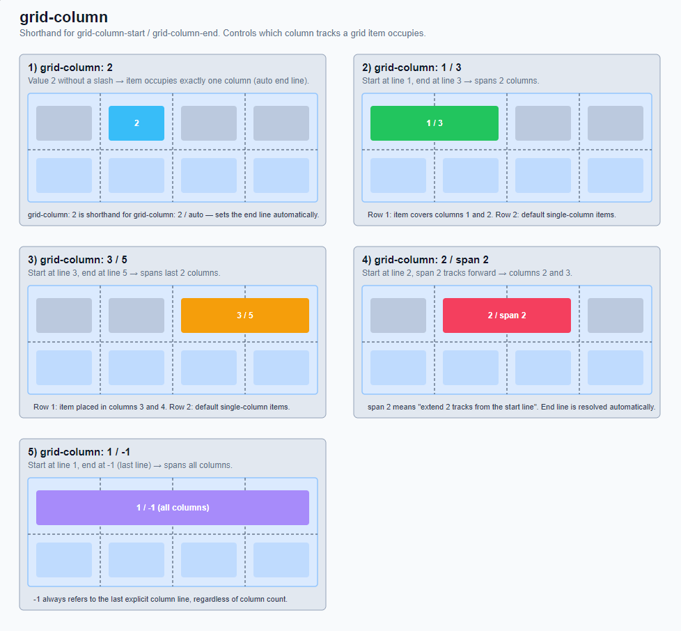
GridColumn:
Is a shorthand for "grid-column-start" and "grid-column-end". It determines in which column a grid item begins and ends, i.e., which columns it occupies.
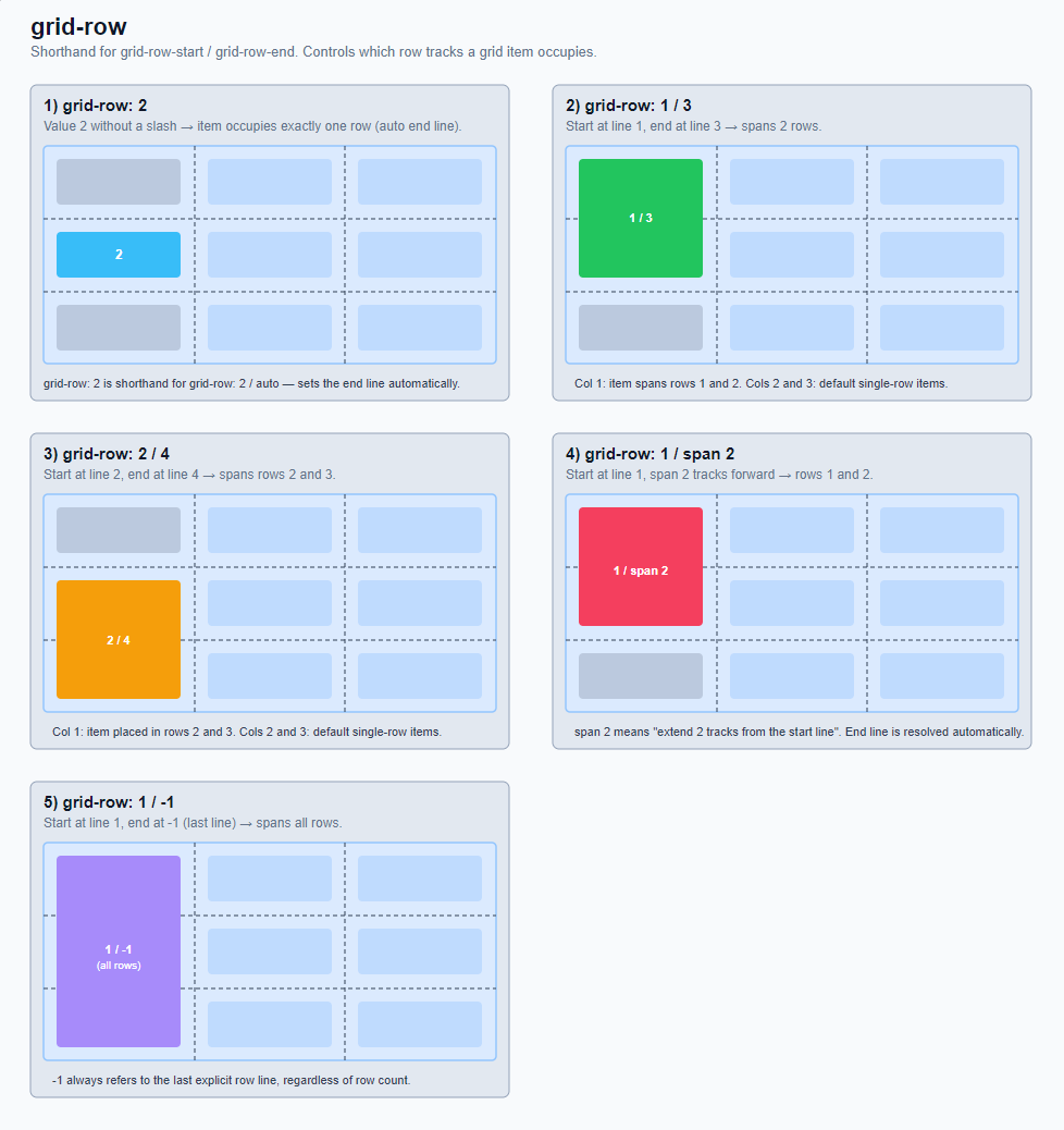
GridRow:
Is a shorthand for "grid-row-start" and "grid-row-end". It determines in which row a grid item begins and ends - i.e. which rows it occupies.
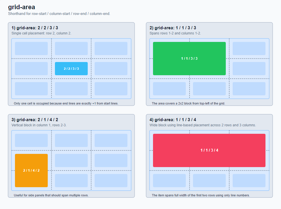
GridArea:
Can be used for the following properties.
- It is a shorthand for "grid-row-start", "grid-column-start", "grid-row-end", "grid-column-end".
- It can assign a grid item to a named area from "grid-template-areas". (currently not supported)
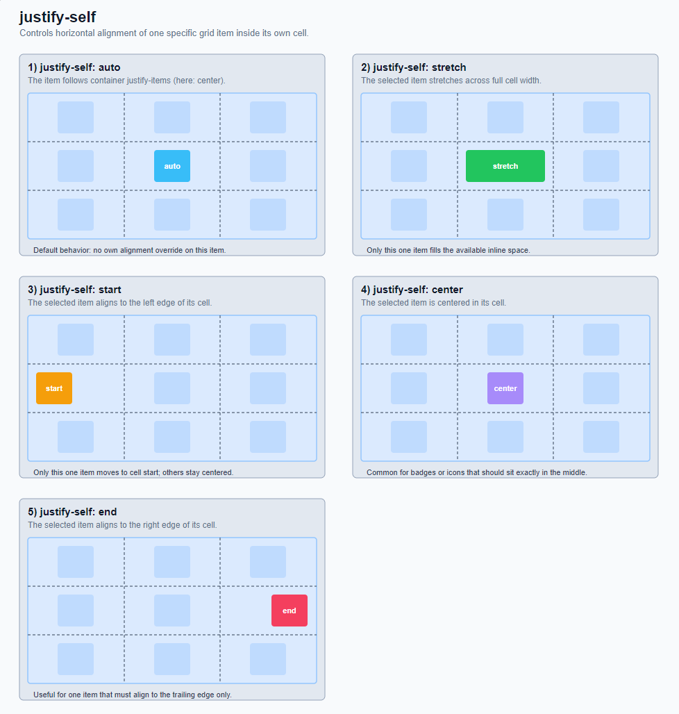
JustifySelf:
Controls the alignment of an individual grid item on the inline axis (usually horizontal) in the CSS grid. It works within the own grid cell of this one item.
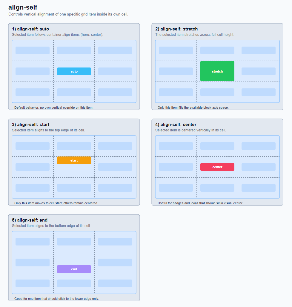
AlignSelf:
Controls the alignment of a single grid item on the block axis (usually vertical) in the CSS grid. It works within the own grid cell of this one item.