RowClassesProvider
Can be used to change the display of table rows or cells depending on the data. To do this, the attribute is configured with a user-defined function that takes the contents of a single table row and returns an array of strings that are set as CSS classes on the respective row element. Using a custom CSS file or theme, these classes can be used to customize the look of the table.
Schema: tchmi:framework#/definitions/Function
Attribute getter
public getRowClassesProvider(): IFunction | undefined;Parameter
Name | Type | Description |
|---|---|---|
- | - | - |
Return value
Type | Description |
|---|---|
The current value of the attribute. |
Attribute setter
public setRowClassesProvider(valueNew: IFunction | null): void;Parameter
Name | Type | Description |
|---|---|---|
valueNew | The new value of the attribute. If null is passed, the internal default value is used. |
Return value
Type | Description |
|---|---|
void | No return value. |
 | Available since version 1.14.3.130 |
Example
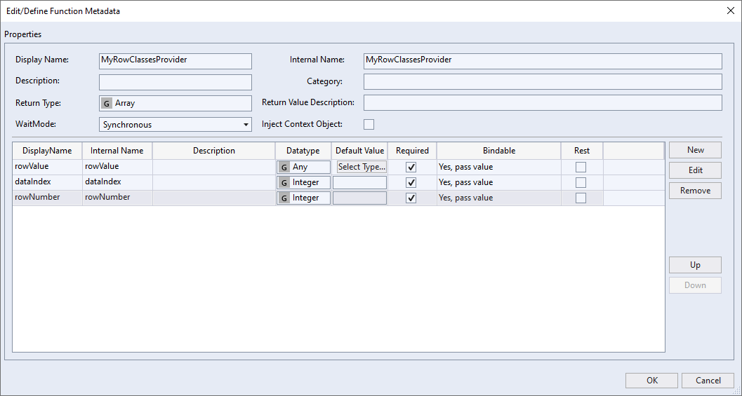
To use this attribute, a new function must first be added to the project. To do this, right-click on the desired folder in your project and select "Add" > "New Item...". In the "Add New Item" dialog, select the "Function (TypeScript)" template, name the new function and click "Add". In the Solution Explorer of your project you will now find two new files, one with the extension ".ts" which contains the code of the function and below it one with the extension ".function.json" which defines the function parameters, the type of the return value and further metadata. Double-click it to open the dialog for configuring the function.
A function to be used as RowClassesProvider must return an array of strings and accept three parameters:
- The value of the table row, i.e. the individual values contained in the array set as the value for the SrcData attribute or bound to the DataSymbol attribute. If a data type for the row values exists, it can be used here, otherwise use the type "
tchmi:general#/definitions/Any". - The 0-based index of the table row in the original array. This parameter is of type "Integer"
- The row number of the row in the table. The row number is 0-based and is not affected by the RowNumbersStartNumber attribute. However, it may differ from the index in the original array if the data in the data grid is sorted or filtered.
Configure the function as follows:
Then you can program the function itself. For this example, a data grid is used that still contains the default values for SrcData and Columns that were applied when the control was created. The goal is to color every second row light gray, as well as highlight every cell that contains an active checkbox in green. The following code is used for this purpose:
export function MyRowClassesProvider(
    rowValue: {
        Test1: string;
        Test2: number;
        Test3: boolean;
        Test4: string;
    },
    dataIndex: number,
    rowNumber: number
) {
    const classes: string[] = [];

    if (rowNumber % 2 === 1) {
        classes.push('odd');
    }

    if (rowValue.Test3) {
        classes.push('active');
    }

    return classes;
}
Since no TypeScript type exists for the default value of the data, the inline type is defined here. Of course, if there is an existing TypeScript type, that can be used as well. Otherwise, the code is simple. The conditions for which CSS classes are to be set are checked one after the other, the corresponding classes are added to an array and this is finally returned.
To use these CSS classes now, a new stylesheet file must be added to the project. In this the classes can be used as follows:
.TcHmi_Controls_Beckhoff_TcHmiDatagrid tr.odd td.TcHmi_Controls_Beckhoff_TcHmiDatagrid-template-cell {
    background-color: #ededed;
}

.TcHmi_Controls_Beckhoff_TcHmiDatagrid tr.active td[data-column-name="Test3"] {
    background-color: green;
}
The class .TcHmi_Controls_Beckhoff_TcHmiDatagrid restricts the application of style rules to data grid controls. The CSS classes defined in the function are now addressed with tr.odd or tr.active. td.TcHmi_Controls_Beckhoff_TcHmiDatagrid-template-cell selects all cells. If the class were omitted and only td was used, the cells of the row numbers would also be addressed. td[data-column-name="Test3"] selects only the cells where the "Test3" field of the data is displayed.
The result looks like this:
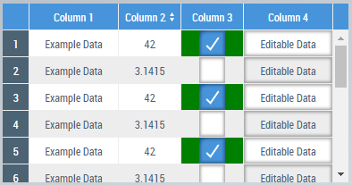
The RowClassesProvider function is automatically re-executed each time the data is changed. So if you check or uncheck a checkbox in this data grid, the coloring of the cell will be updated immediately.
In this sample, only the background color of the cells is adjusted, but of course a whole range of other CSS properties can also be used to change the typeface or integrate background images, for example.