Configure Visualization Elements
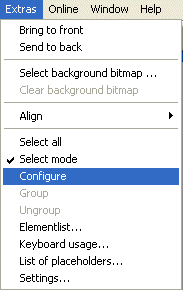
'Extras' 'Configure'
With this command, the 'Configure element' dialog opens for configuring the selected visualization element (see Select visualization element). You are given the dialog box when you double-click on the element.
Select a category in the left area of the dialog box (available categories depending on element type) and fill out the requested information in the right area. This has to be done by activating options resp. by inserting the name of valid variables, whose values should define the property of the element.
There are also configuration dialogs available for a group of elements. Regard that the settings will be valid for the "element" group. If you want to configure the particular elements of the group, you have to resolve the group.
If you have defined an element property by a "static" setting as well as dynamically by a variable, then in online mode the variable will overwrite the static value (Example: "Alarm color Inside" can be defined statically in category 'Color' and additionally dynamically in category 'Colorvariables' by a variable). If the setting is controlled by a "normal" project variable as well as by a structure variable, then the value of structure variable also will be overwritten by the "normal" project variable.
 | Meter, Bar Display and Histogram must be re-grouped before! |
At locations in the element configuration where variables are operative, the following Entries are possible:
- Variable names, for which input assistant is available
- Expressions which are assembled from component accesses, field accesses with constant index, variables, and direct addresses.
- Operators and constants, which can be combined at will with the expressions.
- Placeholders instead of variable names or text strings.
Examples of permissible expressions:
 x + y
100*PLC_PRG.a
TRUE
NOT PLC_PRG.b
9*sin(x + 100)+cos(y+100)
Function calls are not possible. Invalid expressions result in an error message on login („Invalid Watch expression...").
Examples of invalid expressions:
fun(88)
a := 9
RETURN.
There are two possible ways in the configuration dialogs to write global variables: „.globvar" and „globvar" are equivalent. The style with a dot (which is that used in the Watch- and Recipe Manager) is not allowed within an assembled expression, however.
Regard also the possibility of using Placeholders.
Angle
In the configuration dialog 'Configure Pie' in the Angle category you can each enter a value or a variable defining the start angle and the end angle of the sector element in degrees. The sector will be drawn clockwise from the start angle position to the end angle position.
Example:
Enter start angle: "90", end angle: "180"

Dialog for Configuration of angles:
Shape
In the visualization element configuration dialog box, you can select in the Shape category from among Rectangle, RoundedRectangle, Line and Ellipse respectively Polygon, Line and Curve.
The form will change into the size already set.
Text
Dialog for configuration of elements

In the dialog for configuring visualization elements, you can specify a text for the element in the Text category. This can be entered directly or/and a variable can be defined which will determine the text string. The usage of placeholders is possible. Also the default settings for font and alignment are done here.
As soon as text parameters are additionally provided dynamically, which means by a system or structure variable (see also below, category 'Text variables' resp. 'Programmability'), the static definitions which are done in the currently opened dialog , will be overwritten !
 | In case of multiple definition of an element property consider the specific order of precedence concerning according to which a value might be overwritten in online mode by another. |
Enter the text in the Content field. With the key combination <Crtl>+<Enter> you can insert line breaks, with <Crtl>+<Tab>, tab stops. Besides the input of a pure text string you can use the following formatting sequences:
- If you include "%s "into the text, then this location, in Online mode, will be replaced by the value of the variable from the Text Output field of the Variables category. You also can use a formatting string, which conforms with the standard C-library function 'sprintf':
Character | Argument / Output as |
|---|---|
d,i | Decimal number |
o | Unsigned octal number (without leading zerol) |
x | Unsigned hexadecimal number (without leading 0x) |
u | Unsigned decimal number |
c | Single character |
s | String |
f | REAL-values [-]m.dddddd, whereby the accuracy defines the number of d's (Default is 6). The plus sign resp. minus sign defines right aligned (default) or left aligned , m is the number of all decimal (position before decimal point, decimal point, position after decimal point) d defines number of decimal after point. |
The value of the variable will be displayed correspondingly in online mode. You can enter any IEC-conforming format strings, which fit to the type of the used variable.
 | It is not checked whether the type which is used in the formatting string matches with the type of the variable which is defined in the 'Text Output' field ! |
Example:
Input in the 'Content' field: Fill level %2.5f mm
Input in the 'Text Output' field e.g.: fvar1 (REAL variable)
→Output in online mode e.g.: Fill level 32.89997 mm
- If you enter "%t ", followed by a certain sequence of special placeholders, then this location will be replaced in Online mode by the system time. The placeholders define the display format, see the following table.
Do not insert any other characters before %t in the 'Content' field (in contrast this is allowed for e.g. "%s", see above)
Placeholder | Format |
|---|---|
%a | Abbreviated weekday name. I.e. "Wed" |
%A | Full weekday name. I.e. "Wednesday" |
%b | Abbreviated month name. I.e. "Feb" |
%B | Full month name. I.e. "February" |
%c | Date and time representation appropriate for locale <Month>/<Day>/<Year> <Hour>:<Minutes>:<Seconds>, i.e. "08/28/02 16:58:45" |
%d | Day of month as decimal number (01-31), i.e. "24" |
%H | Hour in 24-hour format (00 – 23), i.,e. "16" |
%I | Hour in 12-hour format (01 – 12), i.e. "05" |
%j | Day of year as decimal number (001 – 366), i.e. "241 |
%m | Month as decimal number (01 – 12) i.e. "3" for March |
%M | Minute as decimal number (00 – 59) i.e. "13" |
%p | Current locale’s A.M./P.M. indicator for 12-hour clock. |
%S | Second as decimal number (00 – 59) |
%U | Week of year as decimal number, with Sunday as first day of week (00 – 53) |
%w | Weekday as decimal number (0 – 6; Sunday is 0) |
%W | Week of year as decimal number, with Monday as first day of week (00 – 53) |
%x | Date representation for current locale <Month>/<Day>/<Year>, i.e. "08/28/02" |
%X | Time representation for current locale <hours>:<Minutes>:<Seconds>, i,e. "16:58:45" |
%y | Year without century, as decimal number (00 – 99), i,e. "02" |
%Y | Year with century, as decimal number i,e. "2002" |
%z, %Z | Time-zone name or abbreviation; no characters if time zone is unknown |
%% | Percentsign |
Examples:
%t%a %b %d.%m.%y %H:%M:%S
-> Display in online mode: Wed Aug 28.08.02 16:32:45
Between the placeholders you can insert any text strings:
%Today is %d.%m.%y
-> Display in online mode: Today is 28.08.02
If a text string is to be transferred into a translation file, which will then be used in Online mode to enable switching into another national language, it must be delimited at the beginning and end by #.
Examples: "#Pump 1#" or else even "#Pump# 1"
The second case might for example, in the event of multiple occurrences of the text Pump (Pump 1, Pump 2, etc.), prevent multiple appearances in the translation
- If you include" %<PREFIX>" into the text, you can enter instead of "PREFIX" a certain string, which will serve as an identifier concerning the use of dynamic texts. The prefix will be used together with an ID number, which is to be defined in the 'Variables' category of the configuration dialog in field 'Textdisplay'. The combination references to a certain text, which is contained in a xml-file listing all possible dynamic texts.Thus at run time the text which is indicated by the current ID-Prefix-combination will be displayed. For further information see also the description of 'Settings', category Language
The configured text will appear online in the prescribed alignment within the element: horizontallyleft, center or right and verticallytop, center or bottom.
If you use the Font button, a dialog box for selection of the font will appear. Select the desired font and confirm the dialog with OK. With the Standard-Font button you can set the font that is selected in the project options ('Project' 'Options' 'Editor'). If the font is changed there, then this font will be displayed in all elements except in those elements for which another font has explicitly been selected by using the Font button
Textvariables
Dialog Box for Configuring Visualization Elements (Text Category)
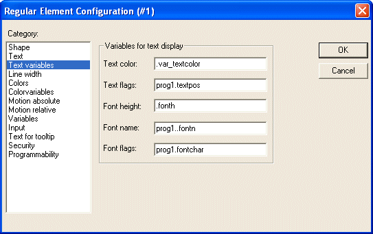
variable which should dynamically set color and font of that string which is defined in category 'Text'. At best enter the variable name with the aid of the input assistant (<F2>).
You can also use components of the structure VisualObjectType to set the text properties. For this see the description of category 'Programability'; there you will find the possible values of the particular structure components and their effect.
If there are corresponding static definitions in category 'Text', these will be overwritten by the dynamic parameter values
 | In case of multiple definition of an element property consider the specific order of precedence concerning according to which a value might be overwritten in online mode by another. |
The parameters of the dialog:
Parameter | Meaning: | Example entry of project variable: | Example Usage of variable in program: | corresponding component of structure VisualObjectType: |
|---|---|---|---|---|
Textcolor: | Textcolor | "plc_prg.var_textcolor" | var_textcolor=16#FF00FF -> color | dwTextColor |
Textflags: | Alignment (right, left, centered...) | "plc_prg.textpos" | textpos:=2 --> Text right justified | dwTextFlags |
Fontheight: | Font height in Pixel | ".fonth" | fonth:=16; -> Font height 16 pt | ntFontHeight |
Fontname: | Font-name | "vis1.fontn" | fontn:=arial; -> Arial is used | stFontName |
Fontflags: | Font display (bold, underlined, italic...) | "plc_prg.fontchar" | fontchar:=2 -> Text will be displayed bold | dwFontFlags |
Line width
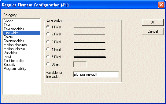
In the dialog for configuring visualization elements, you can choose the line width for an element. As predefined options you find width settings from 1 to 5 pixel, additionally an other value can be entered manually (Other:), or a project variable (Variable for line width:) can be inserted. For the latter the input assistance ((<F2>) can be used.
As soon as the parameter is additionally defined dynamically, i.e. by a structure variable (see below, category 'Programmability'), the static setting will be overwritten in online mode.
 | In case of multiple definition of an element property consider the specific order of precedence concerning according to which a value might be overwritten in online mode by another. |
Dialog for configuring visualization elements (category Textvariables)
Colors
Dialog Box for Configuring Visualization Elements (Line width category)
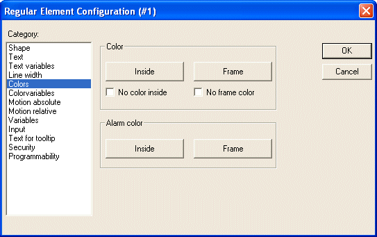
In the visualization element configuration dialog box, in the Color category you can select primary colors and alarm colors for the inside area and for the frame of your element. Chosing the options no color inside and no frame color you can create transparent elements
As soon as the parameter is additionally defined dynamically by a variable, the static setting will be overwritten in online mode
 | In case of multiple definition of an element property consider the specific order of precedence concerning according to which a value might be overwritten in online mode by another. |
Dialog Box for Configuring Visualization Elements (Color Category)
If you now enter a Boolean variable in the Variables category in the Change Color field, then the element will be displayed in the Color set, as long as the variable is FALSE. If the variable is TRUE, then the element will be displayed in its Alarm Color.
The change color function only becomes active, if the PLC is in Online Mode!
If you want to change the color of the frame, then press the Frame button, instead of the Inside button. In either case, the dialog box will open for selection of the color.
Here can to choose the desired hue from the primary colors and the user-defined colors. By pressing the Define Colors you can change the user-defined colors
Color Variables
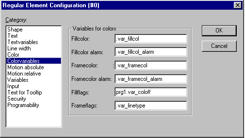
Dialog Box for Configuring Visualization Elements (Color Category)
Here you can enter project variables (e.g. PLC_PRG.color_inside), which should determine the particular property in online mode: These property definitions also or additionally can be programmed with the aid of components of the structure VisualObjectType. Therefore see the description on the "Programability" of a visualization element. There you will find a list of the possible values and their effects.
The variables, entered in the Color Variables dialog, in online mode will overwrite the static values given in the 'Color' category as well as corresponding values given by a structure variable.
 | In case of multiple definition of an element property consider the specific order of precedence concerning according to which a value might be overwritten in online mode by another. |
The parameters of the dialog:
Parameter | Description: | Example of an entry: | Example for using the variable in the program: | corresponding component of structure VisualObjectType |
|---|---|---|---|---|
Fillcolor: | fill color | "plc_prg.var_fillcol" | var_fillcol:= 16#FF00FF -> Fill color Pink | dwFillColor |
Fillcolor alarm: | fill color if the 'Change color' variable is TRUE | "plc_prg.var_fillcol_a" | var_fillcol_a:= 16#FF00FF -> Alarm fill color Pink | dwFillColorAlarm |
Frame color: | frame color | "plc_prg.var_framecol" | var_framecol:= 16#FF00FF -> frame color Pink | dwFrameColor |
Framecolor Alarm: | frame color if the 'Change color' variable is TRUE | "plc_prg.var_framecol" | var_framecol:= 16#FF00FF -> alarm frame color Pink | dwFrameColorAlarm |
FillFlags: | The current inside color configuration can be activated (FALSE) resp. deactivated (TRUE). | "plc_prg.var_col_off" | var_col_off:=1 | dwFillFlags |
FrameFlags: | Display of the frame (solid, dotted etc.) | "plc_prg.var_linetype" | var_linetype:=2; -> frame will be displayed as dotted line | dwFrameFlags |
Motion absolute
In the visualization element configuration dialog box, in the Motion absolute category, X- or Y-Offset fields variables can be entered. These variables can shift the element in the X or the Y direction, depending on the respective variable value. A variable in the Scale field will change the size of the element linear to its current value. This value, which is used as scaling factor, will be divided by 1000 implicitely, so that it is not necessary to use REAL-variables in order to get a reduction of the element. The scaling always will refer to the balance point.
A variable in the Angle field causes the element to turn on its turning point, depending on the value of the variable. (Positive Value = Mathematic Positive = Clockwise). The value is evaluated in degrees. With polygons, every point rotates; in other words, the polygon turns. With all other elements, the element rotates, in such a way, that the upper edge always remains on top.
The turning point appears after a single click on the element, and is displayed as a small black circle with a white cross. You can drag the turning point with a pressed left mouse button.
In online mode the variables which are set in the 'Motion absolute' dialog will override the values of structure components which additionally might be used to define the same property ('Programability').
 | In case of multiple definition of an element property consider the specific order of precedence concerning according to which a value might be overwritten in online mode by another. |
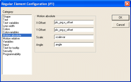
Visualization Element Configuration Dialog Box (Motion Absolute Category)
Motion relative
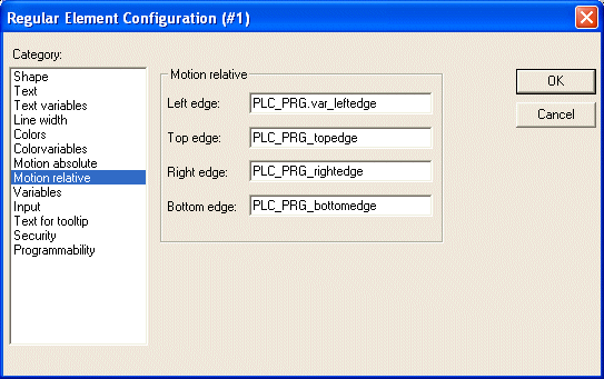
Dialog Box for Configuration of Visualization Elements (Motion Relative Category)
In the dialog for configuring visualization elements in the Motion Relative category, you can assign variables to the individual element edges. Depending on the values of the variables, the corresponding element edges are then moved. The easiest way to enter variables into the fields is to use the Input Assistant (<F2>).
The four entries indicate the four sides of your element. The base position of the corners is always at zero. A new value in the variables, in the corresponding column, shifts the boundary in pixels around this value. Therefore, the variables that are entered ought to be INT variables.
 | Positive values shift the horizontal edges downward, or, the vertical edges, to the right! |
In online mode the variables which are set in the 'Motion absolute' dialog will override the values of structure components which additionally might be used to define the same property ('Programmability').
 | In case of multiple definition of an element property consider the specific order of precedence concerning according to which a value might be overwritten in online mode by another. |
Variables
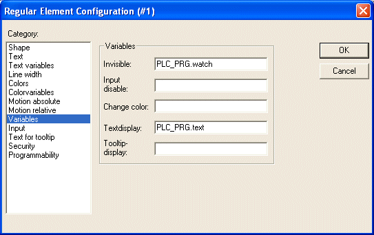
You can enter the variables that describe the status of the visualization elements in the Variable category within the dialog box for configuring visualization elements. The simplest way to enter variables in the fields is to use the Input Assistant.
In online mode the variables which are set in the 'Motion absolute' dialog will override the values of structure components which additionally might be used to define the same property ('Programability').
 | In case of multiple definition of an element property consider the specific order of precedence concerning according to which a value might be overwritten in online mode by another. |
You can enter Boolean variables in the Invisible and Change color fields. The values in the fields determine their actions. If the variable of the Invisible field contains the value FALSE, the visualization element will be visible. If the variable contains the value TRUE, the element will be invisible.
Disable input: If the variable entered here is TRUE, all settings of category 'Input' will be ignored.
Change color: If the variable which is defined in this field, has the value FALSE, the visualization element will be displayed in its default color. If the variable is TRUE, the element will be displayed in its alarm color.
Textdisplay:
- If you have inserted a "%s" in the Content field of the Text category or if you have included "%s" in the textstring, then the value of the variable which is defined in 'Textdisplay' will be displayed in online mode in the visualization object. "%s" will be replaced by the value.
- If you have inserted resp. included a "%<PREFIX>" in the Content field of the Text category ("PREFIX" must be a sequence of letters), then the variable resp. the numeric value which is entered here in 'Textdisplay' will be interpreted as an ID, which in combination with the prefix serves as a reference on a text, which is described in a XML-file. This text will be displayed in online mode instead of "%<PREFIX>" in the visualization object. Thus a dynamic modification of the text display is possible. See further information in the description of the dialog 'Settings', category Language.
- If you want to edit the value of the variable in Online mode using the keyboard, you can do this via the 'Text input of variable' 'Textdisplay' in the Input category.
Tooltip-display: Enter here a variable of type STRING whose value should be displayed in a tooltip for the element in online mode.
Input
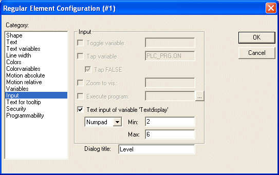
Dialog for configuring the visualization elements (Category Input)
Toggle variable: If this option is activated, in online mode you will toggle the value of the variables which are located in the input field by each mouse click on the visualization element. You can obtain input assistance for data entry via <F2>. The value of the Boolean variable changes with each mouse click from TRUE to FALSE and then back to TRUE again at the next mouse click, etc.
Tap Variable: If this option is activated, in online mode you can switch the value of the Boolean variable which is located in the input field, between TRUE and FALSE. Place the mouse cursor on the element, press the mouse-key and hold it depressed. If option Tap FALSE is activated, the value is set to FALSE as soon as the mouse key is pressed, otherwise it is set to TRUE at this moment. The variable changes back to its initial value as soon as you release the mouse key.
Zoom to Vis...: If this option is activated, you can enter in the edit field the name of a visualization object of the same project to which you want to jump by a mouse-click on the element in online mode. In this case always first the window of the target visualization will be opened before that of the current one will be closed.
The following entries are allowed:
- The name of a visualization object of the current project (see Object Organizer)
- If a visualization reference that contains placeholders is to be jumped to, the placeholders can be directly replaced by variable names or text when called up. For this purpose, conform to the following syntax:
<Visuname>(<Placeholder1>:=<Text1>, <Placeholder2>:=<Text2>,..., <Placeholder n>:=<Textn>).
During compilation of the visualization it will be checked, whether the text matches with one of the defined replacement values defined in the placeholder list, if it does not, a warning will be output.
Example:
Calling the visualization visu1, whereby the placeholders $var_ref1$ and $var_ref2$ used in visu1 are replaced by the variables PLC_PRG.var1 and PROG.var1 respectively:
visu1(var_ref1:=PLC_PRG.var1, var_ref2:=PROG.var1 - If a program variable of the type STRING (e.g. PLC_PRG.xxx) has been entered instead of a visualization object, then this variable can be used to define the name of the visualization object (e.g. ,visu1') which the system should change to when a mouse click occurs (e.g. xxx:= ,visu1).
- If you issue the command „ZOOMTOCALLER" in the Zoom to vis. field, a backward jump into the calling visualization is achieved in Online mode by a mouse click on the element, if such a constellation was configured.
 | The use of a program variable is not permitted for the PLC HMI CE. |
The implicit variable CurrentVisu (type STRING, for implicit (system) variables see here) describes the name of the currently opened visualization object. For example it can be used in the application to control which visualization should be opened resp. to see which is the currently opened. But this will only work if the names of the visualization objects are defined in capital letters (see 'Create a visualization object'). Example: CurrentVisu:='TC_VISU';
Execute program: If this option is activated you can enter ASSIGN- or special "INTERN"-commands in the input field, which will be executed in online mode as soon as you perform a mouse-click on the element. Press button "..." to get the dialog Configure programs where you can select the desired commands (Add) and arrange them in the desired order (Before, After).
This feature especially is important if the visualization will be the only operating interface of a system (pure operating version). See a description of the commands: Special input possibilities for the TwinCAT PLC Control operating version.
If you select the Text input of variable 'Textdisplay', then in Online mode you will get the possibility to enter an value in this visualization element which will upon pressing <Enter> be written to the variable that appears in the Textdisplay field of the Variables category.
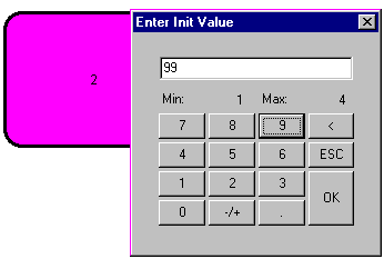
Select in the scroll box which kind of input should be possible later in online mode. Text: An edit field will open, where you can enter the value. Numpad resp. Keypad: A window will open showing an image of the numeric resp. alphabetic keypad, where you can enter a value by activating the appropriate key elements. This might be useful if the visualization must be operatable via a touch screen. The range of valid input values can be restricted by defining a minimum and a maximum value in the edit fields Min: and Max:
 | In case of multiple definition of an element property consider the specific order of precedence concerning according to which a value might be overwritten in online mode by another. |
Tooltip
The dialog Text for Tooltip offers an input field for text which appears in a text field as soon as the mouse cursor is passed over the object in online mode. The text can be formatted with line breaks by using the key combination <Ctrl> + <Enter>.
 | In case of multiple definition of an element property consider the specific order of precedence concerning according to which a value might be overwritten in online mode by another. |
Security
It might be useful that different user groups get different operating possibilities and display of a visualization. This can be reached by assigning different access rights concerning particular visualization elements. You can do this for the eight user groups which are available in TwinCAT PLC Control (see also 'Project' 'Object' 'Properties' resp. 'Project' 'User Group Passwords'). The access rights can be assigned by activating the appropriate option in the configuration dialog 'Access rights' for a visualization element:
Visualization Element Configuration Dialog Box (Category Security)
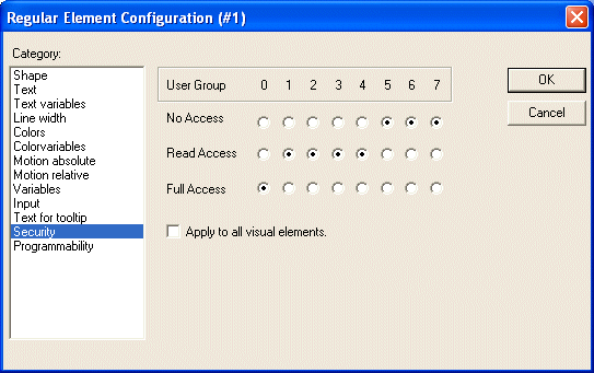
The access rights for a visualization element and their effect in online mode:
|
Access rights |
Description: |
|---|---|
|
No Access |
Element will not be visible |
|
Read Access |
Element will be visible but not operatable (no inputs allowed) |
|
Full Access |
Element is not visible and not operatable |
If you want to assign the access rights also to all other elements of the visualization object, activate option Apply to all visual elements.
 | Please regard, that the access rights which are set for the visualization object in the 'Project' 'Object' 'Properties' dialog, are independent on those of the particular visualization elements ! |
Programability
The properties of an visualization element can not only be defined by a static setting or by a "normal" project variable, but also by the components of a structure variable, which is exclusively used for programming visualization elements.
For this purpose the structure VisualObjectType is available in the library SysLibVisu.lib. Its components can be used to define most of the element properties.
 | Note the evaluation sequence that applies later in online mode: |
To configure the element properties via a structure variable, proceed as follows:
In the configuration dialog of the programmability category, enter a new, unique (!) variable name in the Object name: field in the project. To do this, you need to activate the option by clicking in the check box. The variable automatically receives the type of the structure VisualObjectType, which is part of a library. The declaration is implicit and not directly visible in the project.
After the next compilation run, the structure variable assigned to the visualization element can be used in the project. (Hint: activate the Intellisense function 'List components' in the project options, category Editor, to get the structure elements offered in a selection list after entering the variable name followed by a dot). For example, if you have entered an object name "visu1_line" for a visualization element, you can use visu1_line.nLIneWidth:=4 in the program to set the line thickness for this element.
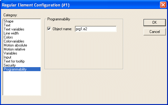
Dialog for configuring the programmability of a visualization element (category Programmability)
The structure VisualObjectType:
The following table shows all elements available in structure VisualObjectType and the corresponding configuration option in the dialogs of the different categories:
The data type is integrated at the beginning of the component name. Where:
n INT
dw DWORD
b BOOL
st STRING
Component | Meaning
| Sample (the object name "vis1" was defined for the element. ) | corresponding setting option in the configuration dialog: |
|---|---|---|---|
nXOffset:INT; | Move the element in X direction | vis1.nXOffset:=val2; | - Cat. Absolute movement: |
nYOffset:INT; | Move the element in Y direction | vis1.nYOffset:=22; | - Cat. Absolute movement: |
nScale:INT; | Resize | vis1.nScale:=plc_prg.scale_var; | - Cat. Movement absolute: |
nAngle:INT; | Rotating the element around its pivot point | vis1.anglevar:=15; | - Cat. Absolute movement:
|
Component | Meaning | Sample (the object name "vis1" was defined for the element. ) | corresponding setting option in the configuration dialog: |
nLeft:INT; | Move the left element edge in X direction. | vis1.nLeft:=val2; | - Cat. Absolute movement: |
nTop:INT; | Shifting the upper element edge in Y-direction. (pos.® move down) | vis1.nTop:=val2; | - Cat. Absolute movement: |
nRight:INT; | Move the right element edge in X direction. | vis1.nRight:=val2; | - Cat. Absolute movement: |
nBottom:INT; | Move the bottom element edge to | vis1.nBottom:=val2; | - Cat. Absolute movement: |
bInvisible:BOOL; | causes change between visible and invisible by changing TRUE and FALSE | vis1.visible:=TRUE; | - Cat. Colors: no color |
stTextDisplay: STRING; | Text that appears in the element | vis1.TextDisplay:='ON / OFF'; Element is labeled with this text | - Cat. Text: Entry at |
bToggleColor: BOOL; | causes color change by changing TRUE and FALSE | vis1.bToggleColor:=alarm_var; | - Cat. Input: Variable |
bInputDisabled: BOOL; | Inputs from category Input are considered with TRUE, not with FALSE | vis1.bInputDisabled:=FALSE; | - Cat. Variables: disable |
stTooltipDisplay:STRING; | Tooltip text | vis1.stTooltipDisplay:= | - Cat. Text for tooltip:
|
Component | Meaning | Sample (the object name "vis1" was defined for the element. ) | corresponding setting option in the configuration dialog: |
dwTextFlags: | Text position: 1 left aligned Both horizontal and vertical positioning should always be set (addition of values)! | vis1.dwTextFlags:=36;
| - Cat. Text: Options from |
dwTextColor : DWORD; | Text color (to enter the color values see after the table) | vis1.dwTextColor := 16#00FF0000; | - Cat. Text: Font | Color |
nFontHeight : INT; | Font height in pixels. | vis1.nFontHeight:=16; | - Cat. Text: Font | Degree' |
dwFontFlags : DWORD; | Font representation. The following flags can be set: 1 italic + Combinations by adding the values | vis1.dwFontFlags:=10; | - Cat. Text: Font | |
stFontName : STRING; | Font name
| vis1.stFontName:='Arial'; | - Cat. Text: font | |
nLineWidth : INT; | Line width of the element frame | vis1.nLWidth:=3; | -Cat. Line width
|
dwFillColor : DWORD; | Fill color.
| vis1.dwFillColor":= | - Cat. Colors: Color | |
Component | Meaning | Sample (the object name "vis1" was defined for the element. ) | corresponding setting option in the configuration dialog: |
dwFillColorAlarm : DWORD; | Fill color in case of alarm (by TRUE of component bToggleColor, see above) | vis1.dwFillColorAlarm:= | - Cat. Colors: Alarm color | |
dwFrameColor: DWORD; | Frame color (for the input of the color values see after the table) | vis1.dwFrameColor:= | - Cat. Colors: Color | |
dwFrameColorAlarm: DWORD; | Frame color in case of alarm (by TRUE of component bToggleColor, see above) | vis1.dwFrameColorAlarm:=16#00808080; (if variable vis1.bToggleColor is set to TRUE, the element frame becomes gray) | - Cat. Colors: Alarm color |
dwFillFlags: DWORD; | Color, as defined with the color variables, can be turned on and off. 0 = switched on, >0 = switched off | vis1.dwFillFlags:=1; | - Cat. Colors: No color |
dwFrameFlags: DWORD; | Frame presentation 0 full line | vis1.FrameFlags:=1; | - Cat. Color variables: |
The input of color values:
Sample: e1.dwFillColor := 16#00FF00FF;
A color is specified as a hexadecimal number resulting from the blue/green/red (RGB) components. The first two zeros after "16#" should be set to fill the DWORD size. 256 (0-255) colors are available for each color value
FF Blue part
00 Green part
FF Red part
Example for a blinking visualization element:
Define a global variable 'blink1' of type VisualObjectType in the configuration of a rectangle. In a program of function block the value of a component of the structure can be modified.
PROGRAM PLC_PRG
VAR
n:INT:=0;
bMod:BOOL:=TRUE;
END_VAR
(* Blinking Element *)
n:=n+1;
bMod:= (n MOD 20) > 10;
IF bMod THEN
    blinker.nFillColor := 16#00808080; (* grey *)
ELSE
    blinker.nFillColor := 16#00FF0000; (* blue *)
END_IF