Website Builder Mobile
The Website Builder Mobile generates user interfaces for the performance characteristics of Smartphones. It is designed for the size of Smartphone displays with touch control. The browser must support jQuery Mobile.
The following browser versions have been tested:
-
 Microsoft Internet
Explorer 9
 -
 Mozilla Firefox 5
 -
 Google Chrome 11
 -
 Apple Mobile Safari 3
(IPhone, IPod touch, IPad)
 -
 Apple Safari 5
 -
 Opera 11
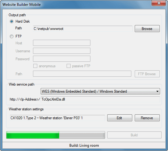
Under the menu item Tools → Website Builder... you can call up the Website Builder Mobile in the following dialog.

The dialog offers the option to specify the storage location for the web pages. If Hard Disk is selected, you can select a location on the hard disk via the Browse button. If FTP is selected the page is stored directly in an FTP folder.
Dependent on the used image the web service is selected. If it is not in the standard directory, the path can be adapted under the entry "user-defined".
To display weather data you can specify a weather station via the Edit button.
Then start the process by pressing the Build button.

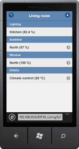
The main screen appears when the page is called up. From there you can navigate to all subsections Arrived at the selected subsection, all assigned elements can be controlled.